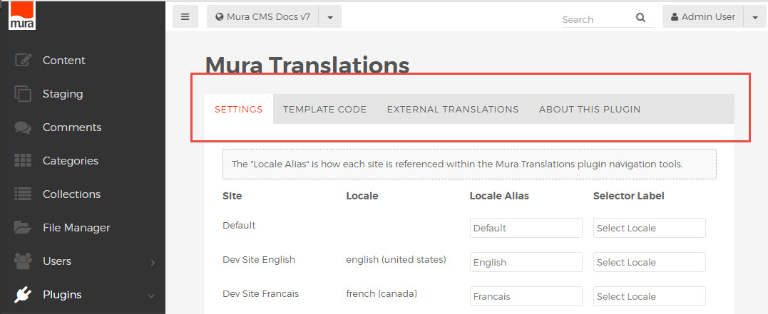
Admin Page Layout
Admin Page Structure
The basic structure of an admin page in Mura 7 includes the sidebar navigation, top toolbar, and the main content area. When creating a custom admin interface or other admin pages as part of a plugin, the plugin's custom page content will be populated inside the main content area.
The heading is a simple <h1> tag, nested inside a div with a class of "mura-header".
<div class="mura-header">
  <h1>#HTMLEditFormat(pluginConfig.getName())#</h1>
</div> <!-- /.mura-header -->
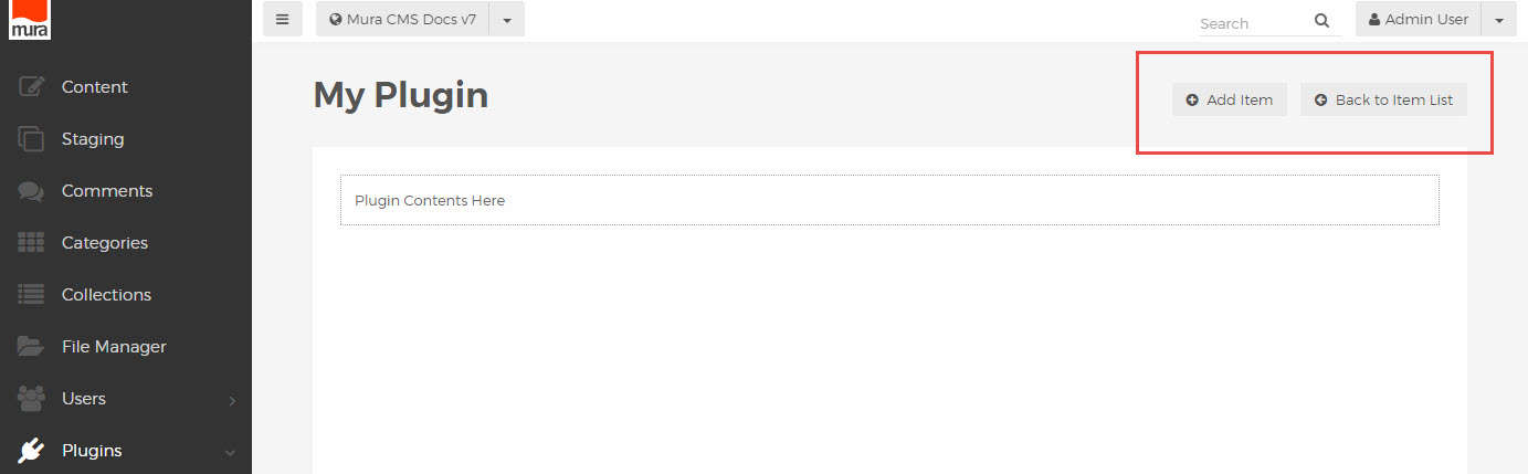
For Mura-style button controls at the top right, an additional element with class of "nav-module-specific" is included in the mura-header container:
<div class="mura-header">
  <h1>My Plugin</h1>
  <div class="nav-module-specific btn-group">
    <a class="btn" title="Add Item" href="/add-item/"><i class="mi-plus-circle"></i> Add Item</a>
    <a class="btn" title="Back to Item List" href="/item-list/"><i class="mi-arrow-circle-left"></i> Back to Item List</a>
  </div>
</div>
The page content is wrapped in a specific set of nested wrapper elements, as follows:
<div class="block block-constrain">
  <div class="block block-bordered">
   <div class="block-content">
    <!--- page content e.g. tabs, form, table, etc. here --->
   </div>
  </div>
</div>
For multiple content areas on a single page, additional "block-content" sections can be added as needed.
Admin Page Overview
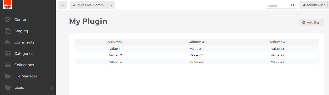
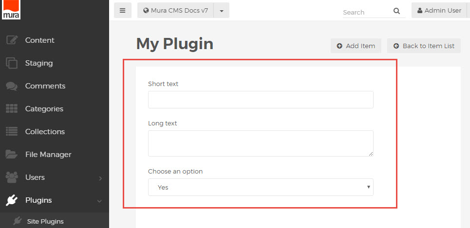
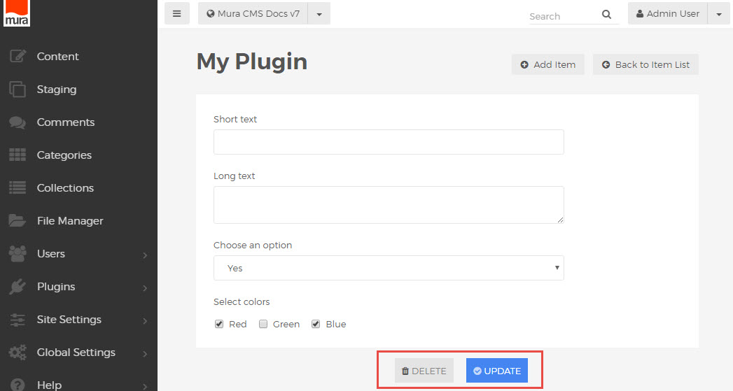
Putting it all together, a basic page with header, buttons and an empty content area should look something like this:
<div class="mura-header">
 <h1>My Plugin</h1>
 <div class="nav-module-specific btn-group">
  <a class="btn" title="Add Item" href="/add-item/"><i class="mi-plus-circle"></i> Add Item</a>
  <a class="btn" title="Back to Item List" href="/item-list/"><i class="mi-arrow-circle-left"></i> Back to Item List</a>
 </div>
</div>
<div class="block block-constrain">
 <div class="block block-bordered">
  <div class="block-content">
   <!--- page content e.g. tabs, form, table, etc. here --->
   </div>
  </div>
</div>
See additional documentation sections for icons, tabs, form and table markup conventions.
Admin Responsive Grid
Admin Column Grouping
As of Mura CMS version 7.0, the admin area utilizes a basic css grid syntax similar to other familiar 12-column systems. Columns can be defined in widths from 1 to 12 by assigning classes like "mura-3" and "mura-6", and are grouped into rows with the class "mura-layout-row".
<div class="mura-layout-row">
  <div class="mura-4">
    <!--- 1/3 page width content here --->
  </div>
  <div class="mura-4">
    <!--- 1/3 page width content here --->
  </div>
  <div class="mura-4">
    <!--- 1/3 page width content here --->
  </div>
</div>
Automatic Half Width
Another way to split the screen in a fluid layout is to use pairs of div containers with the special "half" class, which evenly divides the given area vertically, regardless of screen width.
<div class="half">Left side content</div>
<div class="half">Right side content</div>
When used with "mura-control-group" (see Admin Forms markup documentation), default spacing is applied to the "half" class to keep form elements uniformly arranged without crowding.
<div class="mura-control-group half">
  <label>Left Label</label>
  <input type="text" name="left-text">
</div>
<div class="mura-control-group half">
  <label>Right Label</label>
  <input type="text" name="right-text">
</div>
Keep in mind, these conventions are specific to the Mura admin area only, and differ somewhat from the fractional grid system used in the front end layout manager and display object configurators.
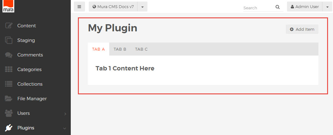
Admin Tabs
Page content in the Mura 7 admin area can be separated into tabbed sections, with the use of a few simple markup conventions to create the tabs and wrap the contents of each tab pane, providing a simple solution to otherwise crowded or complex admin views.
Tab Navigation
The outer structure of a tabbed page differs slightly from the standard admin page layout, in that the "mura-header" is followed by a block element containing an ordered list of tab links.
<div class="mura-header">
...
</div>
<div class="block block-constrain">
  <ul class="mura-tabs nav-tabs" data-toggle="tabs">
    <li class="active"><a href="#tabA" onclick="return false;"><span>Tab A</span></a></li>
    <li class=""><a href="#tabB" onclick="return false;"><span>Tab B</span></a></li>
    <li class=""><a href="#tabC" onclick="return false;"><span>Tab C</span></a></li>
  </ul>
...
</div>
Note the use of the "active" class on the first link. This will load the page with the first link activated by default.
Tab Panes
The tab navigation is followed by a "tab-content" wrapper, which also has class "block-content". It contains each of the tab panes in a special set of nested wrapper elements.
<div class="block-content tab-content">

     <div class="tab-pane active" id="tabA">
        <div class="block block-bordered">
            <div class="block-content">
                <h4>Tab 1 Content Here</h4>
            </div> <!-- /.block-content -->
        </div> <!-- /.block-bordered -->
    </div> <!-- /.tab-pane -->

    <div class="tab-pane" id="tabB">
    ...
    </div> <!-- /.tab-pane -->

    <div class="tab-pane" id="tabC">
    ...
    </div> <!-- /.tab-pane -->

</div> <!-- /.block-content.tab-content -->
Note the use of the "active" class on the first pane. This will load the page with the first tab pane visible by default.
Tab Layout Overview
Putting the pieces together, a basic tabbed page with header, tab navigation and block-level tab pane areas should look something like this:
<div class="mura-header">
    <h1>My Plugin</h1>
    <div class="nav-module-specific btn-group">
        <a class="btn" title="Add Item" href="/"><i class="mi-plus-circle"></i> Add Item</a>
    </div>
</div>

<div class="block block-constrain">

    <ul class="mura-tabs nav-tabs" data-toggle="tabs">
        <li class="active"><a href="#tabA" onclick="return false;"><span>Tab A</span></a></li>
        <li class=""><a href="#tabB" onclick="return false;"><span>Tab B</span></a></li>
        <li class=""><a href="#tabC" onclick="return false;"><span>Tab C</span></a></li>
    </ul>

    <div class="block-content tab-content">

        <div class="tab-pane active" id="tabA">
            <div class="block block-bordered">
                <div class="block-content">
                    <h4>Tab 1 Content Here</h4>
                </div> <!-- /.block-content -->
            </div> <!-- /.block-bordered -->
        </div> <!-- /.tab-pane -->

        <div class="tab-pane" id="tabB">
            <div class="block block-bordered">
                <div class="block-content">
                    <h4>Tab 2 Content Here</h4>
                </div> <!-- /.block-content -->
            </div> <!-- /.block-bordered -->
        </div> <!-- /.tab-pane -->

        <div class="tab-pane" id="tabC">
            <div class="block block-bordered">
                <div class="block-content">
                    <h4>Tab 3 Content Here</h4>
                </div> <!-- /.block-content -->
            </div> <!-- /.block-bordered -->
        </div> <!-- /.tab-pane -->

    </div> <!-- /.block-content.tab-content -->

</div> <!-- /.block.block-constrain -->
Rendering a tabbed page looking something like this:
Admin Tables
Table markup in the Mura 7 admin is fairly standard, with a few special conventions to manage the left hand "actions" menu and fluid-width or hidden responsive columns.
Basic Table Structure
To create a table with the default admin styling, use the class "mura-table-grid" on the <table> element,
with a <thead> wrapper for the header row, and a <tbody> wrapper for the value rows.
<table class="mura-table-grid">
    <thead>
        <tr>
            <th>Column 1</th>
            <th>Column 2</th>
            <th>Column 3</th>
        </tr>
    </thead>
    <tbody>
        <tr>
            <td>Value 1.1</td>
            <td>Value 2.1</td>
            <td>Value 3.1</td>
        </tr>
        <tr> ... </tr>
        <tr> ... </tr>
    </tbody>
</table>
Actions Menu
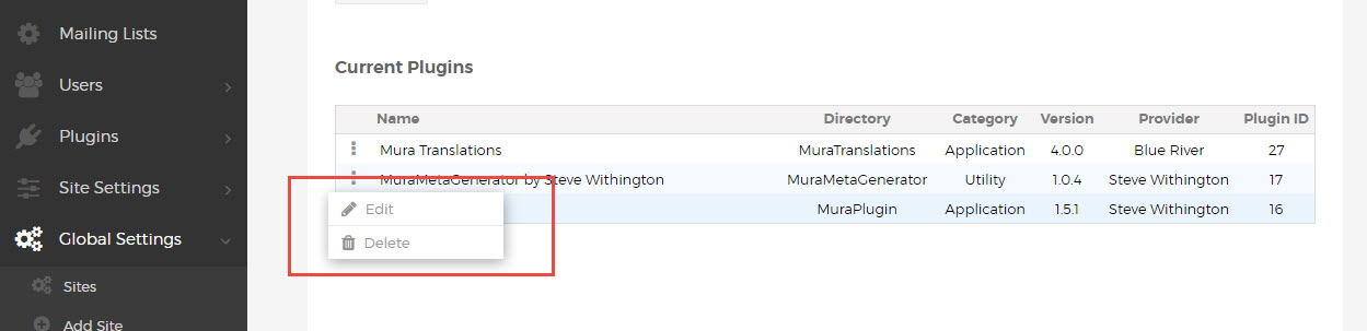
Mura 7.0 introduced the new actions menu component, which appears as a simple drop menu on the left side of many tables. This is simply an ordered list of links, within a cell using the "actions" class, with a special javascript-enabled link with class "show-actions" which shows the actions menu when clicked.
<td class="actions">
  <a class="show-actions" href="javascript:;" ontouchstart="this.onclick();" onclick="showTableControls(this);"><i class="mi-ellipsis-v"></i></a>
    <div class="actions-menu hide">
      <ul class="actions-list">
        <li class="edit"><a href="..."><i class="mi-pencil"></i>Edit</a></li>
        <li class="delete"><a href="##" onclick="..."><i class="mi-trash"></i>Delete</a></li>
      </ul>
    </div>
</td>
This can be used to list any number of additional options, available for each row of the table.
The corresponding header, also using class "actions", appears as extra spacing, matching the width of the actions column below.
Responsive Columns
Keeping with the fluid concepts in the Mura 7 admin, columns can be made flexible by applying the class "var-width" to the <th> header and corresponding <td> cells in the rows of the table. This is most commonly used for the first column, containing the title or name of the item being listed.
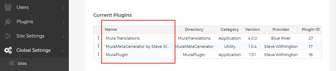
Long text values will be automatically truncated, allowing for flexible-width tables without crowding.
To omit some columns altogether on smaller screen widths, use the standard Boostrap classes, e.g. "hidden-xs", to hide those headers and cells.
<thead>
  <tr>
    <th class="var-width">Column 1</th>
    <th class="hidden-xs">Column 2</th>
    <th>Column 3</th>
    <th>Column 4</th>
  </tr>
</thead>
<tbody>
  <tr>
    <td class="var-width"><a class="alt" title="Column 1" href="...">Value 1.1</a></td>
    <td class="hidden-xs">Value 2.1</td>
    <td>Value 3.1</td>
    <td>Value 4.1</td>
  </tr>
</tbody>
Table Markup Overview
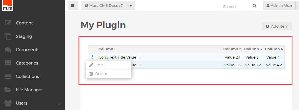
When following the Mura 7 markup conventions for tables in the admin area, your complete table html will look something like this:
<table class="mura-table-grid">
  <thead>
    <tr>
      <th class="actions"></th>
      <th class="var-width">Column 1</th>
      <th class="hidden-xs">Column 2</th>
      <th>Column 3</th>
      <th>Column 4</th>
    </tr>
  </thead>
  <tbody>
    <tr>
      <td class="actions">
        <a class="show-actions" href="javascript:;" ontouchstart="this.onclick();" onclick="showTableControls(this);"><i class="mi-ellipsis-v"></i></a>
        <div class="actions-menu hide">
          <ul class="actions-list">
            <li class="edit"><a href="..."><i class="mi-pencil"></i>Edit</a></li>
            <li class="delete"><a href="##" onclick="..."><i class="mi-trash"></i>Delete</a></li>
          </ul>
        </div>
      </td>
      <td class="var-width"><a class="alt" title="Column 1" href="...">Value 1.1</a></td>
      <td class="hidden-xs">Value 2.1</td>
      <td>Value 3.1</td>
      <td>Value 4.1</td>
    </tr>
    <tr>
      <td class="actions">
        <a class="show-actions" href="javascript:;" ontouchstart="this.onclick();" onclick="showTableControls(this);"><i class="mi-ellipsis-v"></i></a>
        <div class="actions-menu hide">
          <ul class="actions-list">
            <li class="edit"><a href="..."><i class="mi-pencil"></i>Edit</a></li>
            <li class="delete"><a href="##" onclick="..."><i class="mi-trash"></i>Delete</a></li>
          </ul>
        </div>
      </td>
      <td class="var-width"><a class="alt" title="Column 1" href="...">Value 1.2</a></td>
      <td class="hidden-xs">Value 2.2</td>
      <td>Value 3.2</td>
      <td>Value 4.2</td>
    </tr>
  </tbody>
</table>
Rendering a table which looks something like this:
Admin Forms
Admin form markup has been simplified considerably in Mura 7, with the removal of all previously-used form element classes (fieldset, controls, control-label, span-x) and the addition of a simpler convention based on specific groupings of html elements.
Basic Input Groupings
Each form input is paired with its corresponding <label> element inside a wrapper with the "mura-control-group" class applied.
<div class="mura-control-group">
  <label>Some text</label>
  <input type="text" name="myText">
</div>
These are stacked inside of a <form> to create a simple, organized form layout.
<div class="mura-control-group">
  <label>Short text</label>
  <input type="text" name="myText">
</div>
<div class="mura-control-group">
  <label>Long text</label>
  <textarea name="myTextArea"></textarea>
</div>
<div class="mura-control-group">
  <label>Choose an option</label>
  <select name="mySelect">
    <option value="true">Yes</option>
    <option value="false">No</option>
  </select>
</div>
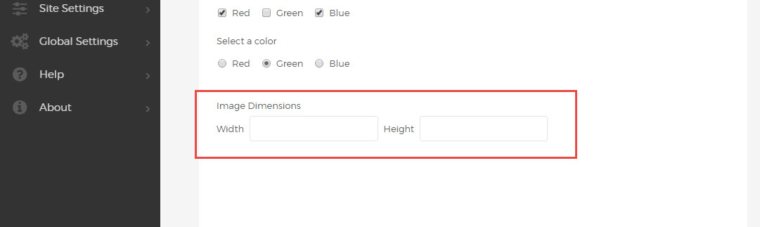
Inline Grouping
For tighter grouping of related inputs, e.g. image width and height controls, follow the <label> with a container using the "mura-control-inline" class, containing label and input pairs for the grouped inputs.
<div class="mura-control-group">
  <label>Image Dimensions</label>
  <div class="mura-control-inline">
    <label>Width</label>
    <input name="width" type="text" value="">
    <label>Height</label>
    <input name="height" type="text" value="">
  </div>
</div>
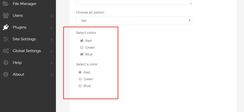
Checkbox and Radio Inputs
One or more checkbox inputs can be grouped inside the same "mura-control-group" wrapper.
A standard <label> element can be used to describe the group, followed by any number of checkbox inputs, grouped in a "checkbox-group" container. Each input is wrapped with a label element using the "checkbox" class.
<div class="mura-control-group">
  <label>Select colors</label>
  <div class="checkbox-group">
    <label class="checkbox"><input type="checkbox" name="myCheckbox1" value="Red">Red</label>
    <label class="checkbox"><input type="checkbox" name="myCheckbox2" value="Green">Green</label>
    <label class="checkbox"><input type="checkbox" name="myCheckbox3" value="Blue">Blue</label>
  </div>
</div>
Radio buttons use a similar syntax, nested inside a "radio-group", and labels with the "radio" class.
<div class="mura-control-group">
  <label>Select a color</label>
  <div class="radio-group">
    <label class="radio"><input type="radio" name="myRadio1" value="red">Red</label>
    <label class="radio"><input type="radio" name="myRadio1" value="green">Green</label>
    <label class="radio"><input type="radio" name="myRadio1" value="blue">Blue</label>
  </div>
</div>
For inline radio and checkbox groupings, displaying multiple controls on one line, remove the group wrappers and add the class "inline" to each of the labels.
<div class="mura-control-group">
  <label>Select colors</label>
  <label class="checkbox inline"><input type="checkbox" name="myCheckbox1" value="Red">Red</label>
  <label class="checkbox inline"><input type="checkbox" name="myCheckbox2" value="Green">Green</label>
  <label class="checkbox inline"><input type="checkbox" name="myCheckbox3" value="Blue">Blue</label>
</div>
<div class="mura-control-group">
  <label>Select a color</label>
  <label class="radio inline"><input type="radio" name="myRadio1" value="red">Red</label>
  <label class="radio inline"><input type="radio" name="myRadio1" value="green">Green</label>
  <label class="radio inline"><input type="radio" name="myRadio1" value="blue">Blue</label>
</div>
Custom UI and Nested Elements
To apply the same formatting and styles to additional elements, or to include custom html inside of any "mura-control-group", use a nested "mura-control" container to wrap the additional content.
<div class="mura-control-group">
  <label>Some text</label>
  <input type="text" name="myText">
  <div class="mura-control">
    <div id="myWidget"> ... </div>
    <a href="/">Custom Link</a>
  </div>
</div>
The "mura-control" wrapper can be used to wrap any additional or custom content within the context of an admin form. To remove the default nested appearance, add the "justify" class to pull the content flush left.
<div class="mura-control justify">
  <div id="myWidget"> ... </div>
</div>
Submit and Control Buttons
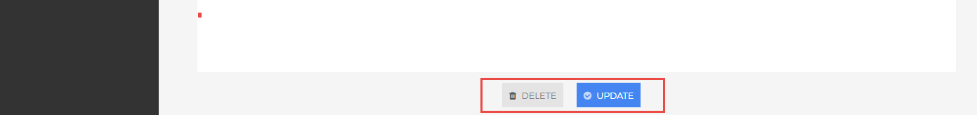
Form controls use their own set of nested wrapper classes, with "form-actions" nested inside of "mura-actions". Buttons use normal form <button> elements, with icons inside of each button (see icons markup conventions). The "mura-primary" class should be applied to the primary form action (save, publish, update, etc.). Keeping with Mura 7 standards, this button should be the last (right-most) element in the form controls area.
<div class="mura-actions">
 <div class="form-actions">
  <button type="button" class="btn" onclick="..."><i class="mi-trash"></i>Delete</button>
  <button type="submit" class="btn mura-primary"><i class="mi-check-circle"></i>Update</button>
 </div>
</div>
Using these markup conventions, a uniform button set will automatically be rendered and placed at the bottom of the form page.
Form Markup Overview
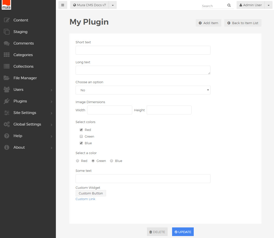
When utilizing these options in a single form, your markup will look something like this:
<form name="myForm" action="/">
  <div class="mura-control-group">
    <label>Short text</label>
    <input type="text" name="myText">
  </div>
  <div class="mura-control-group">
    <label>Long text</label>
    <textarea name="myTextArea"></textarea>
  </div>
  <div class="mura-control-group">
    <label>Choose an option</label>
    <select name="mySelect">
      <option value="true">Yes</option>
      <option value="false">No</option>
    </select>
  </div>
  <div class="mura-control-group">
    <label>Image Dimensions</label>
    <div class="mura-control-inline">
      <label>Width</label>
      <input name="width" type="text" value="">
      <label>Height</label>
      <input name="height" type="text" value="">
    </div>
  </div>
  <div class="mura-control-group">
    <label>Select colors</label>
    <div class="checkbox-group">
      <label class="checkbox"><input type="checkbox" name="myCheckbox1" value="Red">Red</label>
      <label class="checkbox"><input type="checkbox" name="myCheckbox2" value="Green">Green</label>
      <label class="checkbox"><input type="checkbox" name="myCheckbox3" value="Blue">Blue</label>
    </div>
  </div>
  <div class="mura-control-group">
    <label>Select a color</label>
    <label class="radio inline"><input type="radio" name="myRadio1" value="red">Red</label>
    <label class="radio inline"><input type="radio" name="myRadio1" value="green">Green</label>
    <label class="radio inline"><input type="radio" name="myRadio1" value="blue">Blue</label>
  </div>
  <div class="mura-control-group">
    <label>Some text</label>
    <input type="text" name="myText">
    <div class="mura-control justify">
     <div id="myWidget">
      <p>Custom Widget</p>
      <p><button class="btn">Custom Button</button></p>
     </div>
     <a href="/">Custom Link</a>
   </div>
  </div>
  <div class="mura-actions">
    <div class="form-actions">
      <button type="button" class="btn" onclick="..."><i class="mi-trash"></i>Delete</button>
      <button type="submit" class="btn mura-primary"><i class="mi-check-circle"></i>Update</button>
    </div>
  </div>
</form>
Rendering a form looking something like this:
Admin Tooltips
The tooltip markup convention in Mura 7 uses the "data-toggle" attribute, usually applied to a simple <span> element for inline rendering:
<span data-toggle="popover" title="" data-placement="right"
data-content="Tooltip content"
data-original-title="Tooltip Title">
  More Info <i class="mi-question-circle"></i>
</span>
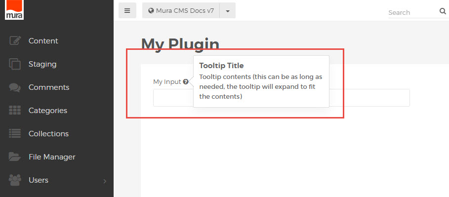
A tooltip can be placed anywhere on the page, most commonly included as the contents of a <label> element in a form.
<label>
  <span data-toggle="popover" title="" data-placement="right"
   data-content="Tooltip contents (this can be as long as needed, the tooltip will expand to fit the contents)"
   data-original-title="Tooltip Title">
     My Input <i class="mi-question-circle"></i>
  </span>
</label>
This renders an inline tooltip with formatted title and message content:
Admin Alerts and Help Blocks
Notification and Info Alerts
The Mura 7 admin area utilizes a fairly standard set of elements for alerts and inline notification or instructions.
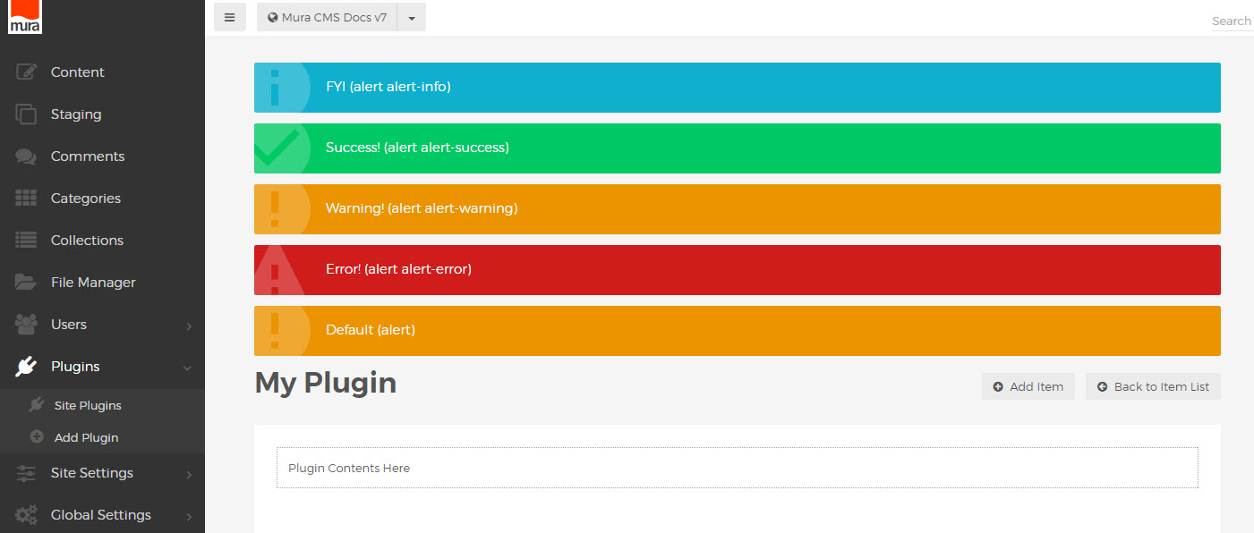
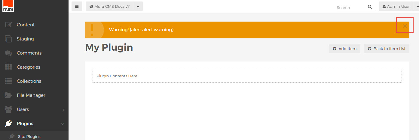
Colored alert notifications can be used to provide confirmations, warnings or other important information.
These should be placed before the "mura-header", at the very top of the main content area.
<div class="alert alert-info"><span>FYI (alert alert-info)</span></div>
<div class="alert alert-success"><span>Success! (alert alert-success)</span></div>
<div class="alert alert-warning"><span>Warning! (alert alert-warning)</span></div>
<div class="alert alert-error"><span>Error! (alert alert-error)</span></div>
<div class="alert"><span>Default (alert)</span></div>
An element with only class "alert" without any other specification, will default to the warning alert style.
It is recommended to wrap the contents in <span> to avoid any block level rendering of other elements such as <a> , <strong> or <span>, which may be used in the text of the alert.
To allow for an alert to be removed or hidden after displaying, a "close" link can be inserted.
<div class="alert alert-warning">
   <span>Warning! (alert alert-warning)
      <button type="button" class="close" data-dismiss="alert"><i class="mi-close"></i></button>
   </span>
</div>
This will automatically add a simple "x" icon in the upper right corner of the alert, which will remove the alert from view when clicked.
Help Blocks and Instructions
To insert general UI instructions, use the "help-block" class to wrap the text:
<div class="help-block">
   Instruction text here
</div>
For auto-width help blocks, used for explanations or prompts with specific UI elements, use "help-block-inline":
<div class="help-block-inline">
   Instructions for this part of the page.
</div>
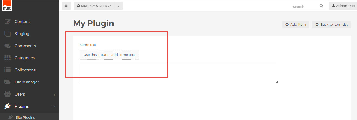
A standard "help-block" element inside a "mura-control-group" element (see Admin Forms markup conventions) will also be auto-width.
<div class="mura-control-group">
    <label>Some text</label>
    <p class="help-block">Use this input to add some text</p>
    <textarea name="myText"></textarea>
</div>
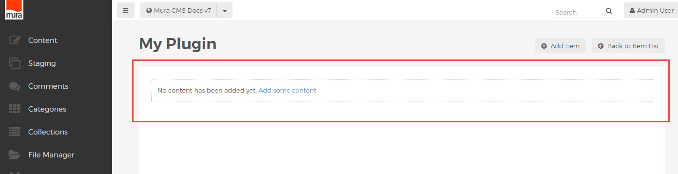
To represent an empty state, such as "no content found" when running a search or showing a list, use the class "help-block-empty".
Admin Icons
Icon Syntax
The Mura 7 admin uses a standardized subset of the Font Awesome library, with hundreds of available icons. Replacing the familiar "fa-" class prefix with "mi-" (for "Mura icon"), these classes are most commonly applied to an <i> element, often inside a link or page heading.
<a href="/add-item/"><i class="mi-plus-circle"></i> Add Item</a>
<a href="/item-list/"><i class="mi-arrow-circle-left"></i> Back to Item List</a>
<h3><i class="mi-cog"></i> Plugin Settings</h3>
Icons are also used in buttons, when saving or cancelling form submissions.
<button class="btn"><i class="mi-trash"></i> Delete</button>
<button typs="submit" class="btn mura-primary"><i class="mi-check-circle"></i> Update</button>
These icon classes may also be used in custom display object configurators.
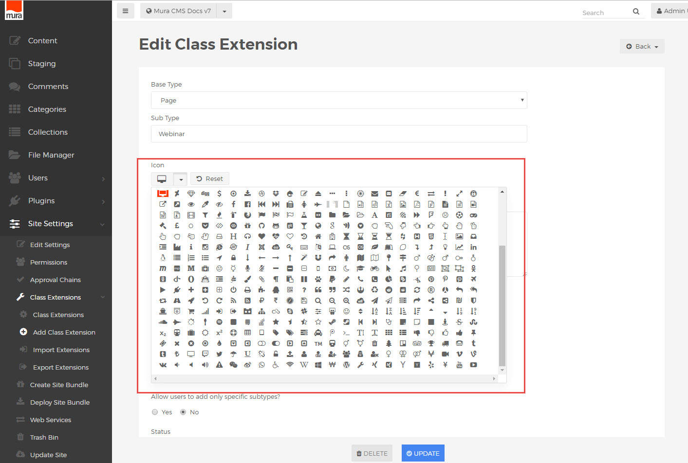
Available Icons
A collective view of the icons used in Mura 7 is available in the Class Extension dialog, when selecting an icon to represent the custom content subtype. Any of these are readily available in the default admin css.
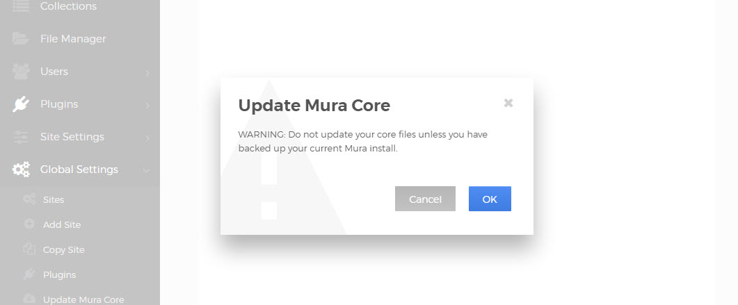
Modal Dialogs and Confirmations
Modal dialogs and confirmation windows can be shown a few different ways, all dependent on the jQuery UI dialog object.
Built-In Dialogs
The Mura 7 admin page template contains a hidden set of elements which can be manipulated to generate a modal dialog.
<div id="alertDialog" title="Alert" class="hide">
  <span id="alertDialogMessage"></span>
</div>
To utilize this built-in dialog method directly, for example showing a confirmation window before submitting a form when a button is clicked, a block of custom javascript can be included in the admin page view. The buttons are defined in a special syntax with their own javascript events assigned (submitting the form, closing the window).
<script type="text/javascript">
$('#myButton').click(function(){
  $('#alertDialogMessage').html(message);
  $('#alertDialog').dialog({
      resizable: false,
      modal: true,
      buttons: {
        'No': function() {
          $(this).dialog('close');
        },
        Yes:
          {click: function() {
            $(this).dialog('close');
            $('#myForm').submit();
          }
          , text: 'Yes'
          , class: 'mura-primary'
        } // /Yes
      }
    });
    return false;
});
</script>
Wrapper Methods
Another option is to use Mura's two wrapper methods, confirmDialog() and alertDialog(), to invoke either a confirmation dialog, requiring the user to read a message and click a button, or an alert dialog, showing an important warning or instructions before proceeding.
For the "confirmDialog()" method, which always uses two buttons for "yes" or "no" selections, specific values can be set when the method is invoked. These include the dialog message, javascript events to fire when clicking the yes or no buttons, the title of the dialog window, the width of the window, text for the buttons, and the class of the dialog itself.
function confirmDialog(message,yesAction,noAction,title,width,yesButtonText,noButtonText,dialogClass) {
...
}
An example of usage when clicking a link:
<a href="#" onclick="confirmDialog('Are you paying attention?',function(){...},function(){...},'Watch out!','600','You bet','Nope','dialog-warning');return false;">
The custom functions would normally be used to continue submitting a form or close the window, as in the previous example using dialog() directly.
For the "alertDialog()" method, which always uses one button to close the alert, similar values can be provided.
function alertDialog(message,okAction,title,width,dialogClass) {
...
}
This will render a simpler dialog with only one button, with the text "OK" to close the dialog and continue:

An example of usage when clicking a link:
<a href="#" onclick="alertDialog('Be sure to pay attention.',function(){...},'Heads up!','400','dialog-warning');return false;">
While configurable with any numeric value, standard widths for Mura's dialog windows are 400 and 600. If no numeric width value is provided, a default width will be used.
For both of these events, the available dialog class values are
dialog-confirm (default)
dialog-info (letter "i" info background)
dialog-warning (warning triangle background)
dialog-nobg (no background)
For reference, the alertDialog() and confirmDialog() methods are contained in Mura's "default.js" file.
Custom Module & Display Object Configurators
The new custom module (display object) code conventions introduced in Mura 7 also include a markup standard for consistency and ease of development.
Configurator Usage
In addition to the default display object types, additional custom display objects can be added to Mura's inline editor for placement on the page. The configurator manages any special settings, values or controls for that particular usage of the display object, and is displayed in the sidebar in the front end editing view.
When coding the "configurator.cfm" rendering template for any custom display object, these conventions should be used to provide optimal results.
Basic Input / Label Grouping
Mura's front-end editor automatically provides the outer markup for any configurator forms rendered in the sidebar, including the html <form> wrapper. The contents of a configurator.cfm file consist of a few basic form elements to create the specific controls for the relevant display object.
Within the <cf_objectconfigurator> tag (see overview example below), each form input is paired with its corresponding <label> element, inside a wrapper with the "mura-control-group" class. (This is similar to standard Admin Form markup conventions.)
For example, a standard text input:
<!--- Text --->
<div class="mura-control-group">
  <label>Text</label>
  <input type="text" name="exampletext" class="objectParam" value="#esapiEncode('html_attr',objectParams.exampletext)#"/>
</div>
Note the use of the objectParam class on the input itself, which is required for editing functionality, along with the dynamic value for the input. These conventions are used universally when creating custom display object configurators.
Standard Input Types
In addition to basic text inputs, other standard form elements can be used, with a similar syntax.
For example, a textarea:
<!--- TextArea --->
<div class="mura-control-group">
  <label>Text Area</label>
  <textarea name="exampletextarea" class="objectParam">#objectParams.exampletextarea#</textarea>
</div>
A select box:
<!--- Select --->
<div class="mura-control-group">
  <label>Select</label>
  <select class="objectParam" name="exampleselect">
     <option value="red"<cfif objectParams.exampleselect is 'red'> selected</cfif>>Red</option>
     <option value="green"<cfif objectParams.exampleselect is 'green'> selected</cfif>>Green</option>
     <option value="blue"<cfif objectParams.exampleselect is 'blue'> selected</cfif>>Blue</option>
  </select>
</div>
Configurator elements with variables or automated values may also be used. For example, a select box with dynamic options via cfloop:
<!--- Select --->
<div class="mura-control-group">
  <label>Select</label>
  <select class="objectParam" name="exampleselect">
    <option value="">Choose a Value</option>
    <cfloop list="1,2,3" item="i">
      <option <cfif objectParams.exampleselect eq i>selected </cfif>value="#i#">#i#</option>
    </cfloop>
  </select>
</div>
Checkbox and Radio Inputs
One or more checkbox inputs can be grouped inside the same "mura-control-group" wrapper.
A standard <label> element can be used to describe the group, followed by any number of checkbox inputs, grouped in a "checkbox-group" container. Each input is wrapped with a label element using the "checkbox" class.
<!--- Checkboxes --->
<div class="mura-control-group">
  <label>Checkboxes</label>
  <div class="checkbox-group">
  <cfloop list="Red,Green,Blue" item="i">
    <label class="checkbox"><input type="checkbox" class="objectParam" name="examplecheckbox" value="#lcase(i)#"<cfif listFindNoCase(objectParams.examplecheckbox,i)> checked</cfif>>#i#</label>
  </cfloop>
  </div>
</div>
Radio buttons use a similar syntax, nested inside a "radio-group" container, and labels with the "radio" class.
<!--- Radio Group --->
<div class="mura-control-group">
  <label>Radio Buttons</label>
  <div class="radio-group">
    <label class="radio"><input type="radio" class="objectParam" name="exampleradio" value="true" <cfif objectParams.exampleradio> checked</cfif>/>Yes</label>
    <label class="radio"><input type="radio" class="objectParam" name="exampleradio" value="false" <cfif not objectParams.exampleradio> checked</cfif>/>No</label>
  </div>
</div>
Configurator Overview
When utilizing these options in a single configurator.cfm file, your markup will look something like this:
<!--- set defaults for form values --->
<cfsilent>
  <cfparam name="objectParams.exampletext" default="">
  <cfparam name="objectParams.exampletextarea" default="">
  <cfparam name="objectParams.exampleselect" default="">
  <cfparam name="objectParams.exampleradio" default="false">
  <cfparam name="objectParams.examplecheckbox" default="">
  <cfparam name="objectParams.examplefile" default="">
</cfsilent>

<!--- cf_objectconfigurator tag adds default inputs --->
<cf_objectconfigurator>
  <cfoutput>

    <!--- Text --->
    <div class="mura-control-group">
      <label>Text</label>
      <input type="text" name="exampletext" class="objectParam" value="#esapiEncode('html_attr',objectParams.exampletext)#"/>
    </div>

    <!--- TextArea --->
    <div class="mura-control-group">
      <label>Text Area</label>
      <textarea name="exampletextarea" class="objectParam">#objectParams.exampletextarea#</textarea>
    </div>

        <!--- Select --->
        <div class="mura-control-group">
         <label>Select</label>
         <select class="objectParam" name="exampleselect">
          <option value="">Choose a Value</option>
          <cfloop list="1,2,3" item="i">
           <option <cfif objectParams.exampleselect eq i>selected </cfif>value="#i#">#i#</option>
          </cfloop>
         </select>
        </div>

    <!--- Checkboxes --->
    <div class="mura-control-group">
      <label>Checkboxes</label>
      <div class="checkbox-group">
      <cfloop list="Red,Green,Blue" item="i">
      <label class="checkbox"><input type="checkbox" class="objectParam" name="examplecheckbox" value="#lcase(i)#"<cfif listFindNoCase(objectParams.examplecheckbox,i)> checked</cfif>>#i#</label>
      </cfloop>
      </div>
    </div>

    <!--- Radio Group --->
    <div class="mura-control-group">
      <label>Radio Buttons</label>
      <div class="radio-group">
        <label class="radio"><input type="radio" class="objectParam" name="exampleradio" value="true" <cfif objectParams.exampleradio> checked</cfif>/>Yes</label>
        <label class="radio"><input type="radio" class="objectParam" name="exampleradio" value="false" <cfif not objectParams.exampleradio> checked</cfif>/>No</label>
      </div>
    </div>

        <!--- Custom CKFinder file selector --->
        <div class="mura-control-group">
            <label>Select File</label>
            <input name="myfile" class="objectParam" value="#esapiEncode('html_attr',objectparams.examplefile)#"><br/>
            <button type="button" class="btn mura-ckfinder" data-target="myfile" data-completepath=false>Select File</button><br/>
        </div>

        <!--- Custom modal window w/ control button --->
        <div class="mura-control-group">
            <button type="button" class="btn" id="open-custom-modal">Open Modal</button>
        </div>
        <input name="trim-params" class="objectParam" type="hidden" value="true"/>
        <script>
            $(function(){
                $('##open-custom-modal').click(function(){
                    siteManager.openDisplayObjectModal('examples/modal.cfm');
                });
            });
        </script>

    </cfoutput>
</cf_objectconfigurator>
Rendering a configurator form looking something like this:
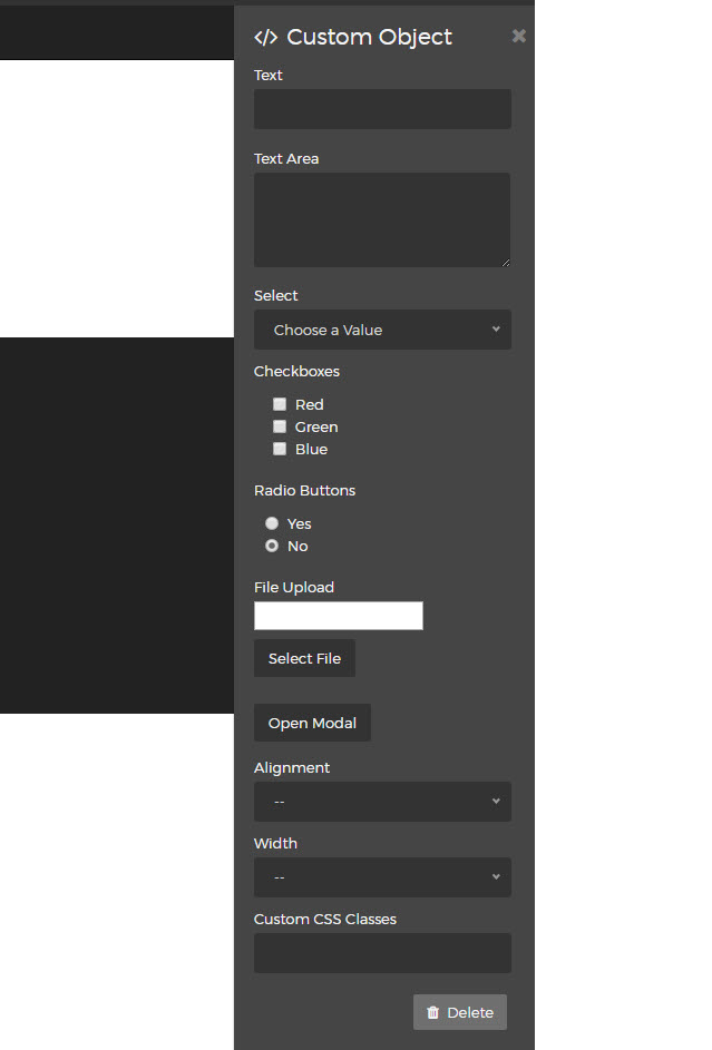
Note the additional "custom css classes" input. This is added automatically by Mura, with the supplied class names applied to the display object container.
For more about using custom display objects in Mura 7, see display objects documentation and getmura.com/blog/mura-cms-7-new-display-object-conventions/ .