Admin Tooltips
The tooltip markup convention in Mura 7 uses the "data-toggle" attribute, usually applied to a simple <span> element for inline rendering:
<span data-toggle="popover" title="" data-placement="right"
data-content="Tooltip content"
data-original-title="Tooltip Title">
  More Info <i class="mi-question-circle"></i>
</span>
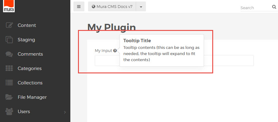
A tooltip can be placed anywhere on the page, most commonly included as the contents of a <label> element in a form.
<label>
  <span data-toggle="popover" title="" data-placement="right"
   data-content="Tooltip contents (this can be as long as needed, the tooltip will expand to fit the contents)"
   data-original-title="Tooltip Title">
     My Input <i class="mi-question-circle"></i>
  </span>
</label>
This renders an inline tooltip with formatted title and message content: