Modal Dialogs and Confirmations
Modal dialogs and confirmation windows can be shown a few different ways, all dependent on the jQuery UI dialog object.
Built-In Dialogs
The Mura 7 admin page template contains a hidden set of elements which can be manipulated to generate a modal dialog.
<div id="alertDialog" title="Alert" class="hide">
  <span id="alertDialogMessage"></span>
</div>
To utilize this built-in dialog method directly, for example showing a confirmation window before submitting a form when a button is clicked, a block of custom javascript can be included in the admin page view. The buttons are defined in a special syntax with their own javascript events assigned (submitting the form, closing the window).
<script type="text/javascript">
$('#myButton').click(function(){
  $('#alertDialogMessage').html(message);
  $('#alertDialog').dialog({
      resizable: false,
      modal: true,
      buttons: {
        'No': function() {
          $(this).dialog('close');
        },
        Yes:
          {click: function() {
            $(this).dialog('close');
            $('#myForm').submit();
          }
          , text: 'Yes'
          , class: 'mura-primary'
        } // /Yes
      }
    });
    return false;
});
</script>
Wrapper Methods
Another option is to use Mura's two wrapper methods, confirmDialog() and alertDialog(), to invoke either a confirmation dialog, requiring the user to read a message and click a button, or an alert dialog, showing an important warning or instructions before proceeding.
For the "confirmDialog()" method, which always uses two buttons for "yes" or "no" selections, specific values can be set when the method is invoked. These include the dialog message, javascript events to fire when clicking the yes or no buttons, the title of the dialog window, the width of the window, text for the buttons, and the class of the dialog itself.
function confirmDialog(message,yesAction,noAction,title,width,yesButtonText,noButtonText,dialogClass) {
...
}
An example of usage when clicking a link:
<a href="#" onclick="confirmDialog('Are you paying attention?',function(){...},function(){...},'Watch out!','600','You bet','Nope','dialog-warning');return false;">
The custom functions would normally be used to continue submitting a form or close the window, as in the previous example using dialog() directly.
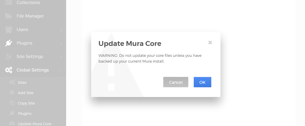
For the "alertDialog()" method, which always uses one button to close the alert, similar values can be provided.
function alertDialog(message,okAction,title,width,dialogClass) {
...
}
This will render a simpler dialog with only one button, with the text "OK" to close the dialog and continue:

An example of usage when clicking a link:
<a href="#" onclick="alertDialog('Be sure to pay attention.',function(){...},'Heads up!','400','dialog-warning');return false;">
While configurable with any numeric value, standard widths for Mura's dialog windows are 400 and 600. If no numeric width value is provided, a default width will be used.
For both of these events, the available dialog class values are
dialog-confirm (default)
dialog-info (letter "i" info background)
dialog-warning (warning triangle background)
dialog-nobg (no background)
For reference, the alertDialog() and confirmDialog() methods are contained in Mura's "default.js" file.