Components
Components are reusable content objects that can be shared across multiple pages or sections within your site. For example, maybe you have an announcement you want to share across your website such as "Closed for Holidays." Without components, you would most likely have to contact a developer, then give the developer a listing of areas you want the notice to appear. However, in this scenario, you most likely would not be able to edit the content of the notice or control whether or not it is on display, etc.
Utilizing components shifts that control back to the content manager. You could create a notice, and choose which page(s) and/or section(s) of the site you would like it to appear, all using a single interface. This means that although the content may span several pages or sections of the site, you can simply edit the component once and it will update all instances throughout the entire site.
Another function of components is to use them as content templates so that non-technical users can recreate a visual style for a specific type of content without having to start from scratch.
How to Create a Component
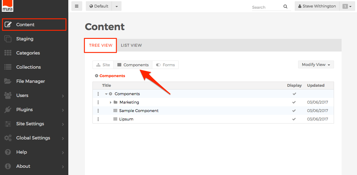
- From the back-end administration area, go to the Content section, select the Tree View tab, then select the Components button.
-
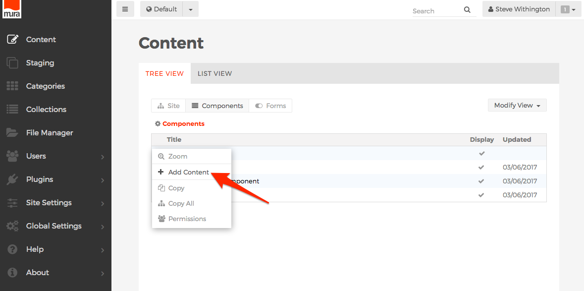
Click the three-dotted menu beside Components and select Add Content.
-
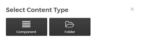
The Select Content Type dialog window should appear.
-
Component
-
The Component option is the most common selection used. Using this option will take you to the Create Component screen, as identified in the next step.
-
-
Folder
-
The Folder option is available so that you can create groupings of Components. This is useful for grouping components logically and also for keeping components used by similar groups of users together so you only need to set permissions on the Folder, versus having to modify permissions for each and every component.
-
-
-
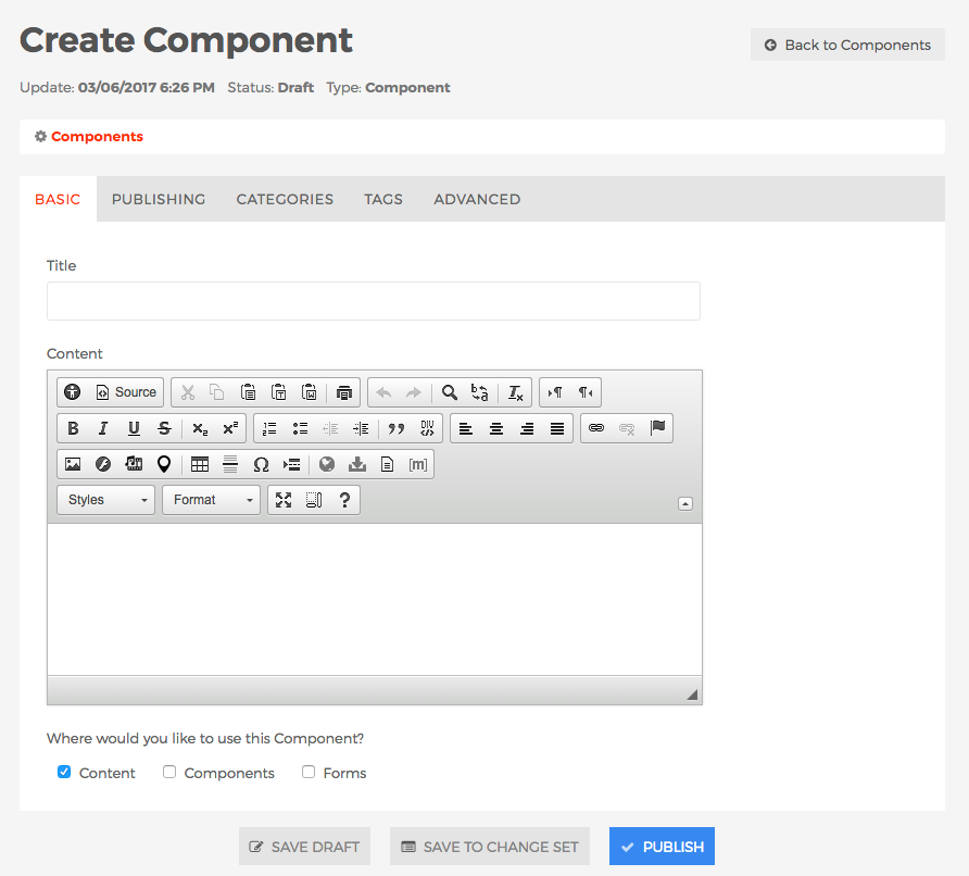
The Create Component screen should appear.
-
Basic Tab
-
Title (required)
-
Enter a title for the component.
-
-
Content
-
Enter your desired content/body.
-
-
Where would you like to use this Component?
-
Content
-
If enabled, the component will appear on the CKEditor's "Insert Component" options list when editing Content.
-
-
Components
-
If enabled, the component will appear on the CKEditor's "Insert Component" option list when editing Components.
-
-
Forms
-
If enabled, the component will appear on the CKEditor's "Insert Component" option list when editing Forms.
-
-
-
-
Publishing Tab
-
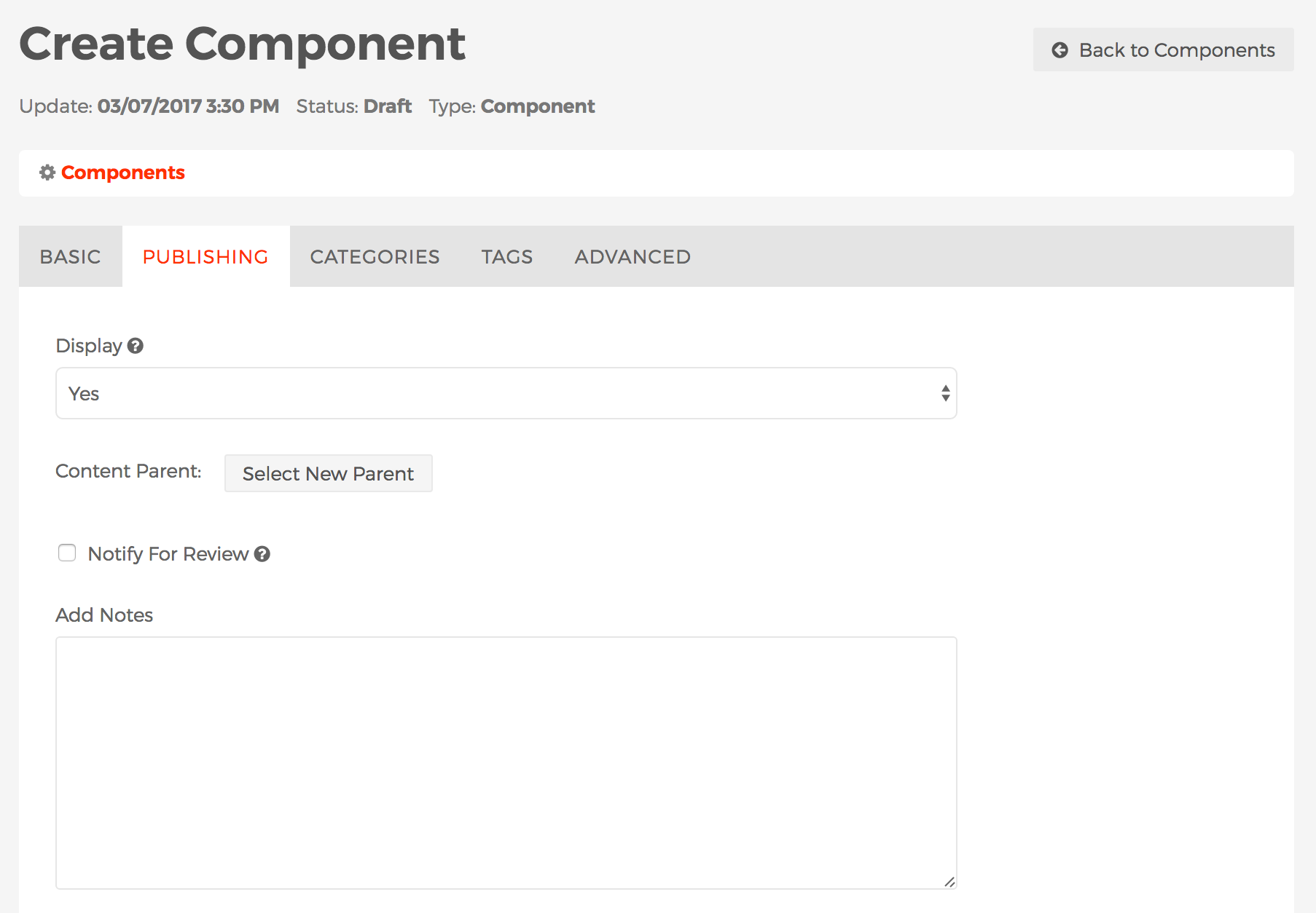
Display
-
This field controls whether or not the component will be visible to users via the public, front-end view of your site.
-
Yes
-
If Yes, then the component will be visible to users via the public, front-end view of your site.
-
-
No
-
If No, the component will not be visible to users via the public, front-end view of your site.
-
-
Per Schedule
-
You may specify a schedule for the component to display, including the frequency of the display such as daily, weekly, monthly, etc. and when the component should stop displaying, if ever.
-
-
-
Content Parent
-
You may use this field to move a component to be grouped under another component or Folder of components. See the Selecting New Parent section for more details and instructions.
-
-
Notify For Review
- When enabled, Send to and Message fields will appear.
- Send to
- You may select one or more users to receive an email notification after saving or publishing the component. To select more than one person, use <CTRL> + click (on a PC) or <CMD> + click (on a Mac).
- Message
- Text entered here will accompany a link to view the component in the email notification.
-
Add Notes
-
This field allows you to enter informational notes which can be shared amongst content managers, without it appearing anywhere on the public, front-end view of the site.
-
-
-
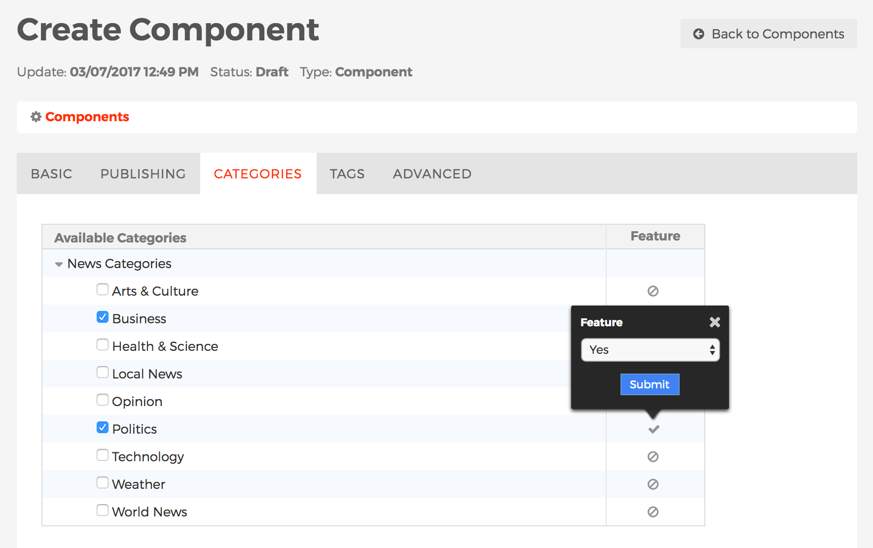
Categories Tab
-
The Categories tab is where you manage a component's Categories. To learn more about Categories, including how to create/manage categories, and categorize content, visit the Categories section.
-
-
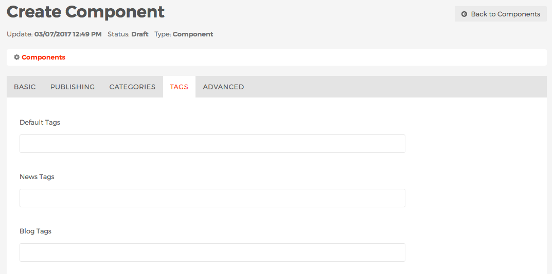
Tags Tab
-
The Tags tab is where you manage a component's Tags. Visit the Tags section to learn more about Mura Tags.
-
-
Advanced Tab
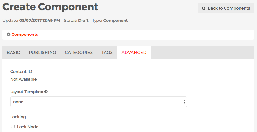
- Content ID
- This is a unique identifier of the component and typically used by developers.
-
Layout Template
-
You may optionally apply a layout template to your component by selecting it from the list of available options.
-
-
Locking
-
Mura offers the ability to "lock" components so they will not be accidentally deleted by content managers.
-
Lock Node
-
If enabled, content managers will not be able to delete the component.
-
-
- Content ID
-
- After completing the form, select your desired publishing option to save your component.
- To add the component to a page or section of your site, please visit the Component Display Object Type section.