Admin Alerts and Help Blocks
Notification and Info Alerts
The Mura 7 admin area utilizes a fairly standard set of elements for alerts and inline notification or instructions.
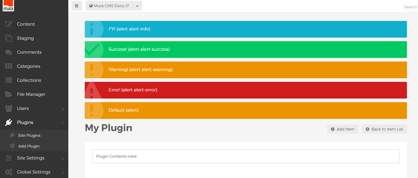
Colored alert notifications can be used to provide confirmations, warnings or other important information.
These should be placed before the "mura-header", at the very top of the main content area.
<div class="alert alert-info"><span>FYI (alert alert-info)</span></div>
<div class="alert alert-success"><span>Success! (alert alert-success)</span></div>
<div class="alert alert-warning"><span>Warning! (alert alert-warning)</span></div>
<div class="alert alert-error"><span>Error! (alert alert-error)</span></div>
<div class="alert"><span>Default (alert)</span></div>
An element with only class "alert" without any other specification, will default to the warning alert style.
It is recommended to wrap the contents in <span> to avoid any block level rendering of other elements such as <a> , <strong> or <span>, which may be used in the text of the alert.
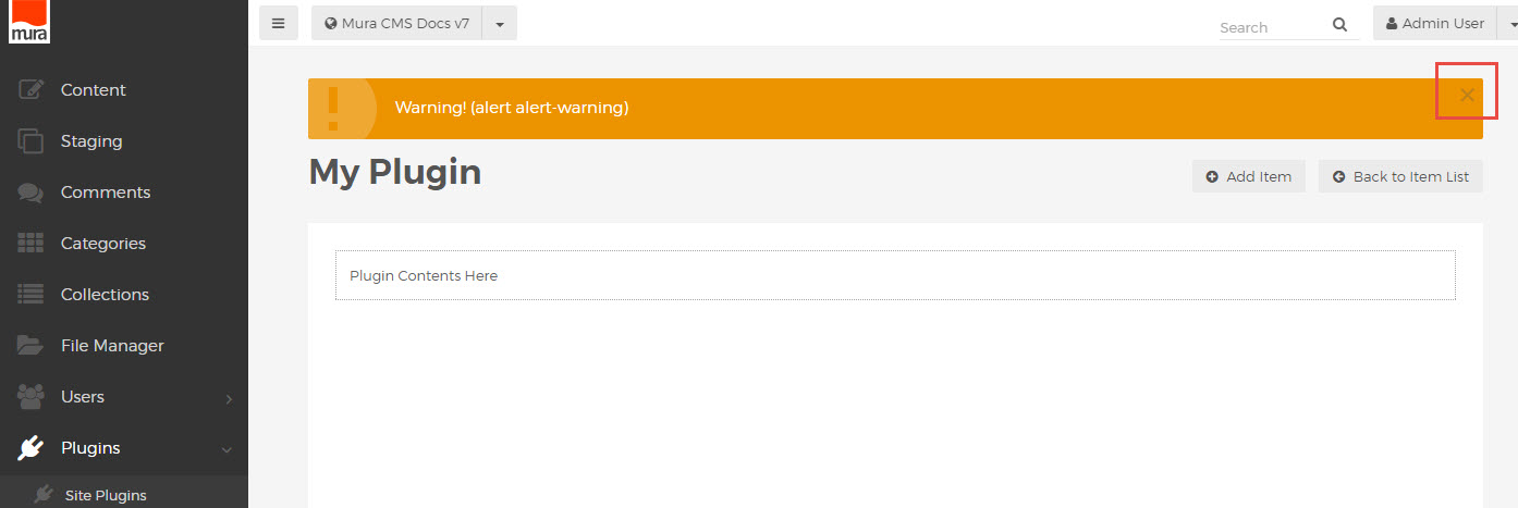
To allow for an alert to be removed or hidden after displaying, a "close" link can be inserted.
<div class="alert alert-warning">
<span>Warning! (alert alert-warning)
<button type="button" class="close" data-dismiss="alert"><i class="mi-close"></i></button>
</span>
</div>
This will automatically add a simple "x" icon in the upper right corner of the alert, which will remove the alert from view when clicked.
Help Blocks and Instructions
To insert general UI instructions, use the "help-block" class to wrap the text:
<div class="help-block">
Instruction text here
</div>
For auto-width help blocks, used for explanations or prompts with specific UI elements, use "help-block-inline":
<div class="help-block-inline">
Instructions for this part of the page.
</div>
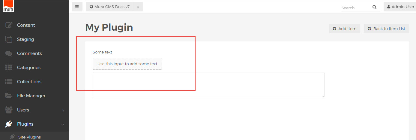
A standard "help-block" element inside a "mura-control-group" element (see Admin Forms markup conventions) will also be auto-width.
<div class="mura-control-group">
<label>Some text</label>
<p class="help-block">Use this input to add some text</p>
<textarea name="myText"></textarea>
</div>
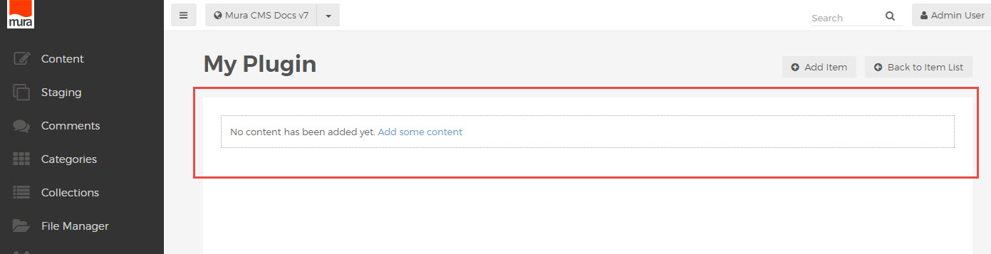
To represent an empty state, such as "no content found" when running a search or showing a list, use the class "help-block-empty".