Admin Forms
Admin form markup has been simplified considerably in Mura 7, with the removal of all previously-used form element classes (fieldset, controls, control-label, span-x) and the addition of a simpler convention based on specific groupings of html elements.
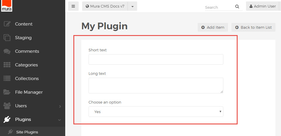
Basic Input Groupings
Each form input is paired with its corresponding <label> element inside a wrapper with the "mura-control-group" class applied.
<div class="mura-control-group">
  <label>Some text</label>
  <input type="text" name="myText">
</div>
These are stacked inside of a <form> to create a simple, organized form layout.
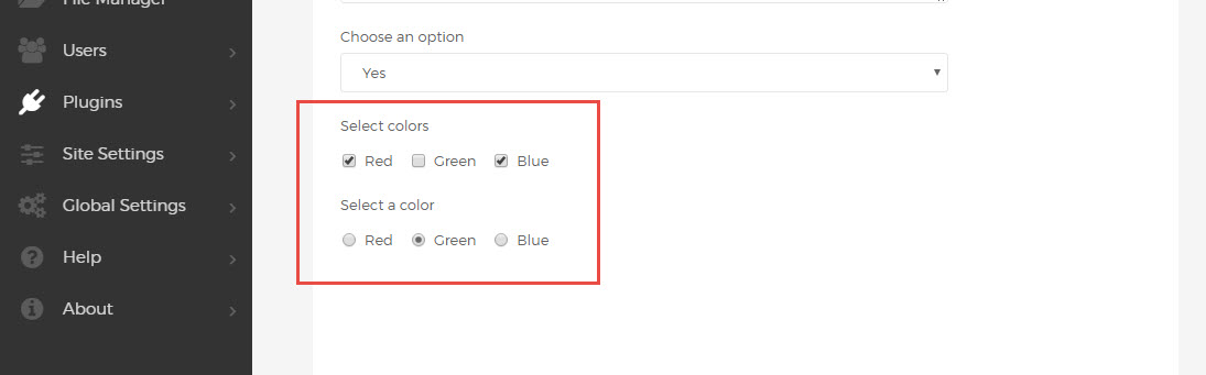
<div class="mura-control-group">
  <label>Short text</label>
  <input type="text" name="myText">
</div>
<div class="mura-control-group">
  <label>Long text</label>
  <textarea name="myTextArea"></textarea>
</div>
<div class="mura-control-group">
  <label>Choose an option</label>
  <select name="mySelect">
    <option value="true">Yes</option>
    <option value="false">No</option>
  </select>
</div>
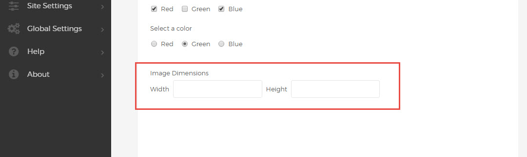
Inline Grouping
For tighter grouping of related inputs, e.g. image width and height controls, follow the <label> with a container using the "mura-control-inline" class, containing label and input pairs for the grouped inputs.
<div class="mura-control-group">
  <label>Image Dimensions</label>
  <div class="mura-control-inline">
    <label>Width</label>
    <input name="width" type="text" value="">
    <label>Height</label>
    <input name="height" type="text" value="">
  </div>
</div>
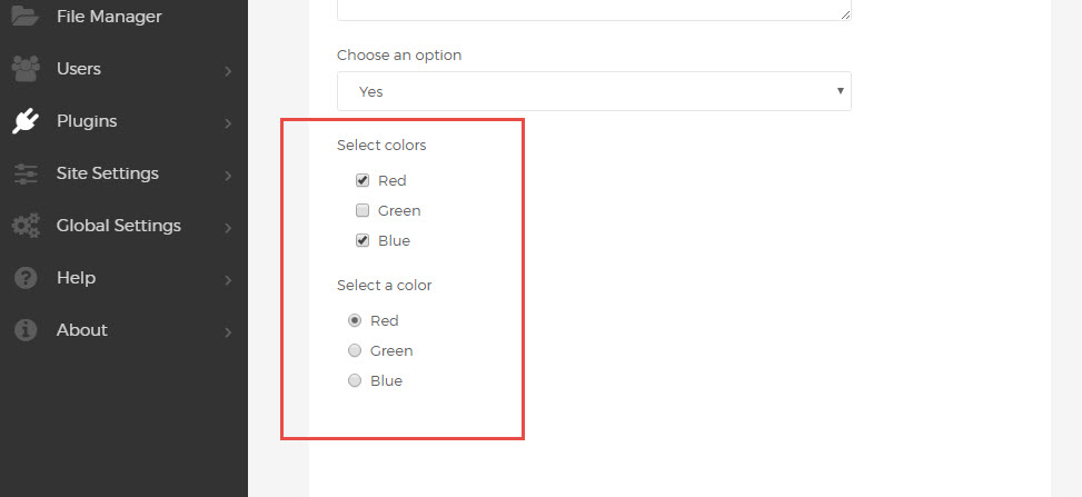
Checkbox and Radio Inputs
One or more checkbox inputs can be grouped inside the same "mura-control-group" wrapper.
A standard <label> element can be used to describe the group, followed by any number of checkbox inputs, grouped in a "checkbox-group" container. Each input is wrapped with a label element using the "checkbox" class.
<div class="mura-control-group">
  <label>Select colors</label>
  <div class="checkbox-group">
    <label class="checkbox"><input type="checkbox" name="myCheckbox1" value="Red">Red</label>
    <label class="checkbox"><input type="checkbox" name="myCheckbox2" value="Green">Green</label>
    <label class="checkbox"><input type="checkbox" name="myCheckbox3" value="Blue">Blue</label>
  </div>
</div>
Radio buttons use a similar syntax, nested inside a "radio-group", and labels with the "radio" class.
<div class="mura-control-group">
  <label>Select a color</label>
  <div class="radio-group">
    <label class="radio"><input type="radio" name="myRadio1" value="red">Red</label>
    <label class="radio"><input type="radio" name="myRadio1" value="green">Green</label>
    <label class="radio"><input type="radio" name="myRadio1" value="blue">Blue</label>
  </div>
</div>
For inline radio and checkbox groupings, displaying multiple controls on one line, remove the group wrappers and add the class "inline" to each of the labels.
<div class="mura-control-group">
  <label>Select colors</label>
  <label class="checkbox inline"><input type="checkbox" name="myCheckbox1" value="Red">Red</label>
  <label class="checkbox inline"><input type="checkbox" name="myCheckbox2" value="Green">Green</label>
  <label class="checkbox inline"><input type="checkbox" name="myCheckbox3" value="Blue">Blue</label>
</div>
<div class="mura-control-group">
  <label>Select a color</label>
  <label class="radio inline"><input type="radio" name="myRadio1" value="red">Red</label>
  <label class="radio inline"><input type="radio" name="myRadio1" value="green">Green</label>
  <label class="radio inline"><input type="radio" name="myRadio1" value="blue">Blue</label>
</div>
Custom UI and Nested Elements
To apply the same formatting and styles to additional elements, or to include custom html inside of any "mura-control-group", use a nested "mura-control" container to wrap the additional content.
<div class="mura-control-group">
  <label>Some text</label>
  <input type="text" name="myText">
  <div class="mura-control">
    <div id="myWidget"> ... </div>
    <a href="/">Custom Link</a>
  </div>
</div>
The "mura-control" wrapper can be used to wrap any additional or custom content within the context of an admin form. To remove the default nested appearance, add the "justify" class to pull the content flush left.
<div class="mura-control justify">
<div id="myWidget"> ... </div>
</div>
Submit and Control Buttons
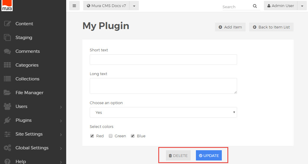
Form controls use their own set of nested wrapper classes, with "form-actions" nested inside of "mura-actions". Buttons use normal form <button> elements, with icons inside of each button (see icons markup conventions). The "mura-primary" class should be applied to the primary form action (save, publish, update, etc.). Keeping with Mura 7 standards, this button should be the last (right-most) element in the form controls area.
<div class="mura-actions">
 <div class="form-actions">
  <button type="button" class="btn" onclick="..."><i class="mi-trash"></i>Delete</button>
  <button type="submit" class="btn mura-primary"><i class="mi-check-circle"></i>Update</button>
 </div>
</div>
Using these markup conventions, a uniform button set will automatically be rendered and placed at the bottom of the form page.
Form Markup Overview
When utilizing these options in a single form, your markup will look something like this:
<form name="myForm" action="/">
  <div class="mura-control-group">
    <label>Short text</label>
    <input type="text" name="myText">
  </div>
  <div class="mura-control-group">
    <label>Long text</label>
    <textarea name="myTextArea"></textarea>
  </div>
  <div class="mura-control-group">
    <label>Choose an option</label>
    <select name="mySelect">
      <option value="true">Yes</option>
      <option value="false">No</option>
    </select>
  </div>
  <div class="mura-control-group">
    <label>Image Dimensions</label>
    <div class="mura-control-inline">
      <label>Width</label>
      <input name="width" type="text" value="">
      <label>Height</label>
      <input name="height" type="text" value="">
    </div>
  </div>
  <div class="mura-control-group">
    <label>Select colors</label>
    <div class="checkbox-group">
      <label class="checkbox"><input type="checkbox" name="myCheckbox1" value="Red">Red</label>
      <label class="checkbox"><input type="checkbox" name="myCheckbox2" value="Green">Green</label>
      <label class="checkbox"><input type="checkbox" name="myCheckbox3" value="Blue">Blue</label>
    </div>
  </div>
  <div class="mura-control-group">
    <label>Select a color</label>
    <label class="radio inline"><input type="radio" name="myRadio1" value="red">Red</label>
    <label class="radio inline"><input type="radio" name="myRadio1" value="green">Green</label>
    <label class="radio inline"><input type="radio" name="myRadio1" value="blue">Blue</label>
  </div>
  <div class="mura-control-group">
    <label>Some text</label>
    <input type="text" name="myText">
    <div class="mura-control justify">
     <div id="myWidget">
      <p>Custom Widget</p>
      <p><button class="btn">Custom Button</button></p>
     </div>
     <a href="/">Custom Link</a>
   </div>
  </div>
  <div class="mura-actions">
    <div class="form-actions">
      <button type="button" class="btn" onclick="..."><i class="mi-trash"></i>Delete</button>
      <button type="submit" class="btn mura-primary"><i class="mi-check-circle"></i>Update</button>
    </div>
  </div>
</form>
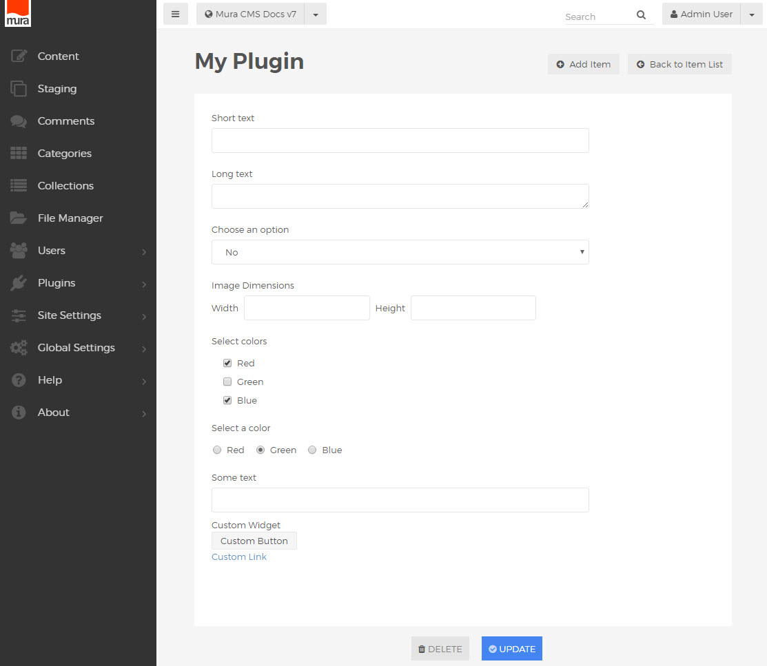
Rendering a form looking something like this: