Layout Templates

With Mura CMS, you can alter the layout template of a content item very easily, and even set the default layout of the children of a particular section of your site.

When it comes to selecting the default layout template for the children, think of this as laying out an outfit for a child to wear. The child could go ahead and wear it, or ignore your suggestion and go pick something else for themselves to wear.

Setting Layout Templates

There are a handful of ways to set and/or change layout templates. The options are listed below.

Via Back-End Content Tree View

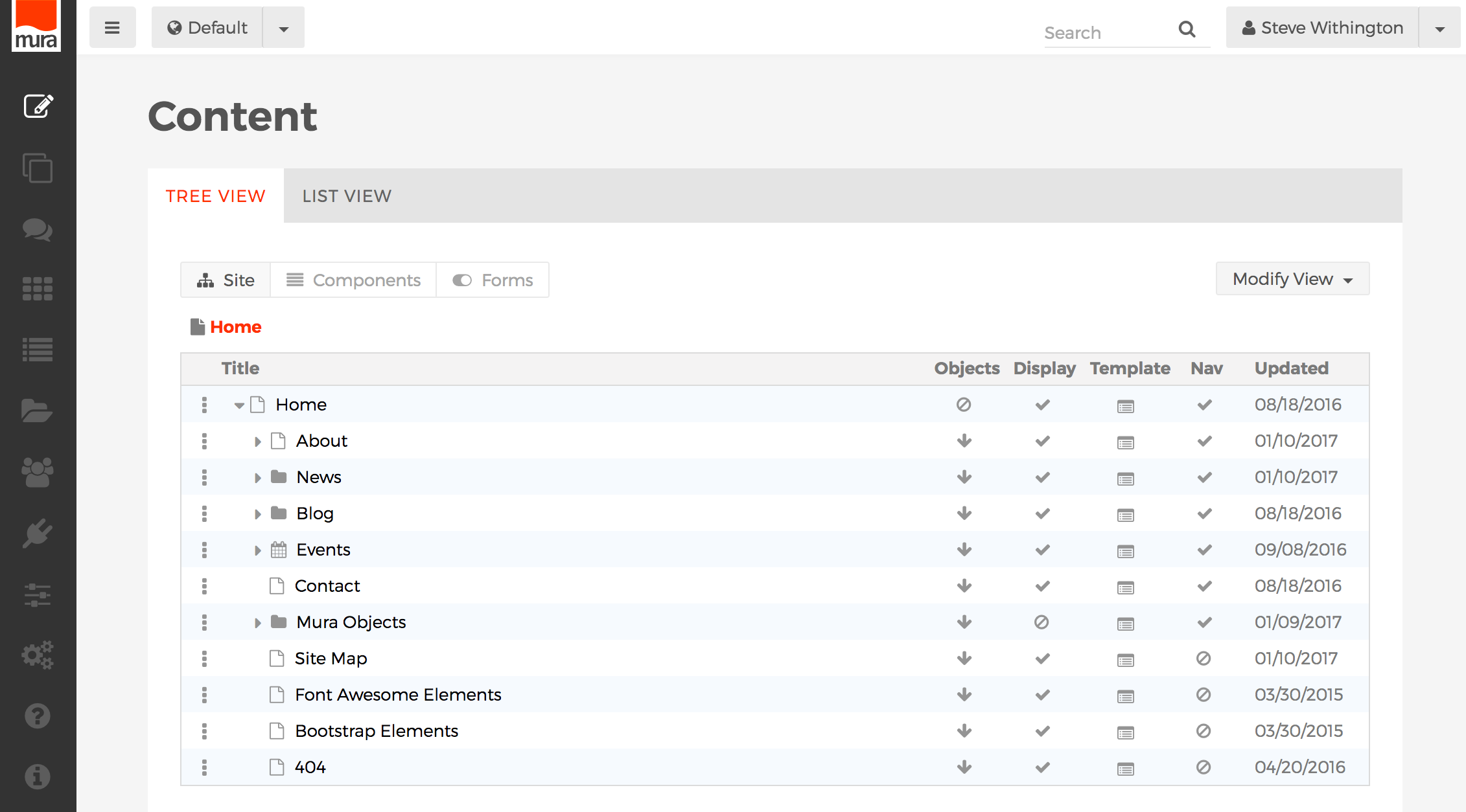
From the back-end administration area of Mura, go to the "Content Tree View" area. Under the Template column, you can see whether or not a content item has its layout explicitly set or is inheriting the layout according to the parent.

If the icon looks like a layout template , then the layout template has been explicitly set for that content item. If the icon looks like a bullet, then it will honor whatever the parent has set as the "Alternate Child Template." If the Alternate Child Template is set to "none," then it will inherit from the "Layout Template" setting.

To change the layout template, or view the layout template settings, simply click the icon in the corresponding row of the content item you wish to edit, and a balloon edit window should appear.

Both the "Layout Template" and "Alternate Child Template" options will list all of the available layout options for your particular theme. When you've selected your desired settings, click "Submit" to save the new settings.

Via Edit Content Item

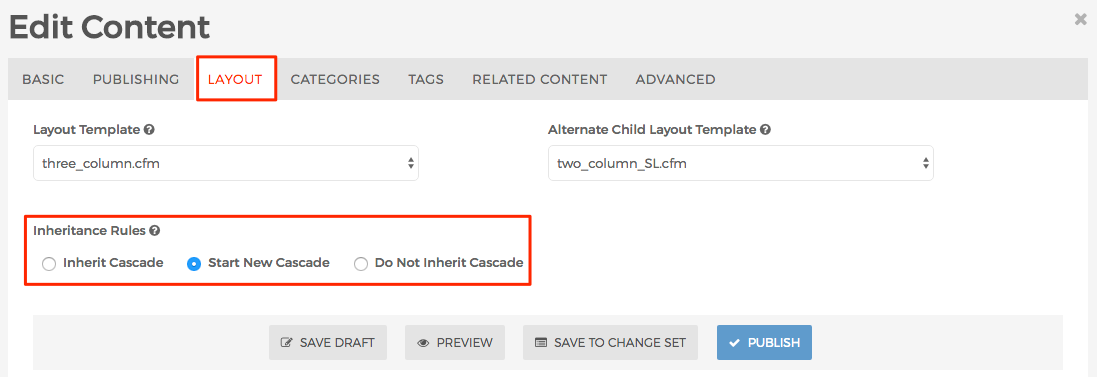
You can also edit the layout template settings by selecting your desired content item, then clicking the "Layout" tab. There, you should see the select menu options for both "Layout Template" and "Alternate Child Template." Make your desired changes, then "Publish" to save the new settings.


Default Layout Templates

The default theme that ships with Mura CMS includes a handful of basic layout templates. However, the developers of your theme may have created their own, unique layout templates for use on the site you will actually be working on. So, template options listed below may be different than the options you see on your own site.

Template Description
blank.cfm This layout template will only output the page title and content.
default.cfm This simply uses the two_column_SL.cfm layout template
home.cfm This layout template is most often used specifically for the Home page
one_column.cfm This layout template includes a Header area with primary navigation, a main body/content region, and a footer area
three_column.cfm This layout template includes a Header area with primary navigation, a "left" column region, a "right" column region, a main body/content region, and a footer area
two_column_SL.cfm The "SL" means "Sidebar Left." This layout template includes a Header area with primary navigation, a "left" column region, a main body/content region, and a footer area
two_column_SR.cfm The "SR" means "Sidebar Right." This layout template includes a Header area with primary navigation, a "right" column region, a main body/content region, and a footer area

Inline Edit Display Objects

Display objects can be used to either enhance your layout or add functionality to your site. By default, Mura CMS includes a number of helpful display objects so you can quickly and easily add elements such as Collections, Components, Forms, and navigational aids. Developers may also create custom display objects, unique to your organization's needs such as a stock ticker, or even a full-blown application to be embedded within a single page or an entire section of your site.

Accessing Display Objects

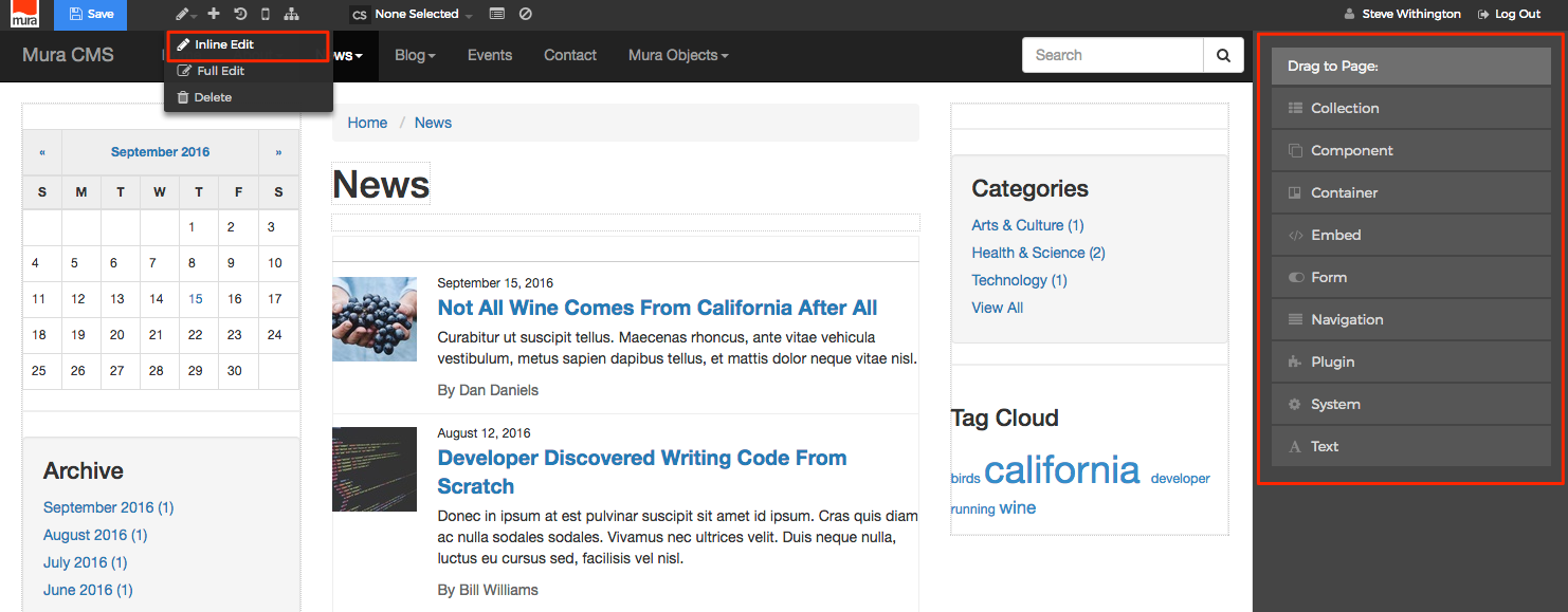
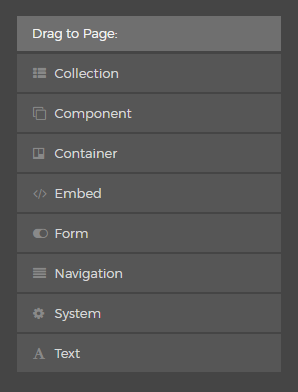
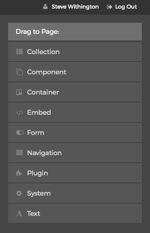
To access inline edit display objects, from the front-end public view of your site, when you hover over the pencil icon located on the front-end toolbar, and select "Inline Edit" the inline edit panel appears on the right-hand portion of the browser. The inline edit panel contains a list of available display objects which can be applied to your layout.

Inheritance Rules

Display objects obey the Inheritance Rules applied to each content item. To edit Inheritance Rules, when editing a content item, select the Layout tab.

The options for Inheritance Rules are outlined below:

  • Inherit Cascade
    • This is the default setting for new content items and "inherits" any display objects applied to the closest parent content item with a setting of "Start New Cascade."
  • Start New Cascade
    • This setting prevents any display objects applied to parent content items from displaying in the layout. Unless a child content item explicitly declares "Start New Cascade" or "Do Not Inherit Cascade," it will display any objects assigned to this specific content item. This setting is most often used on top-level sections of a site, so that display objects such as navigation will automatically appear in the same place throughout an entire section of the site.
  • Do Not Inherit Cascade
    • This is a very unique setting which prevents any display objects from appearing on the specified page, while allowing parental display objects to essentially flow through to its children.

Display Object Types

Visit each section below for an overview of the display objects that ship with Mura CMS. These objects are useful when you set up pages and forms as well as other areas of your site.

Collection

Collections are essentially indexes of content based on pre-defined search criteria or filters. (Visit the Collections section to learn how to create and manage Mura Collections.) The "Collection" display object enables you to quickly and easily place these "indexes of content" throughout your site and layouts so visitors to your site may find additional information they may find interesting or useful to them.

Follow the steps below to apply a Collection to a page or section of your site.

  1. From the front-end public view of your site, hover over the pencil icon on the front-end toolbar and select Inline Edit.
  2. The inline edit panel should appear on the right-hand portion of your browser.
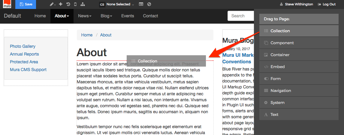
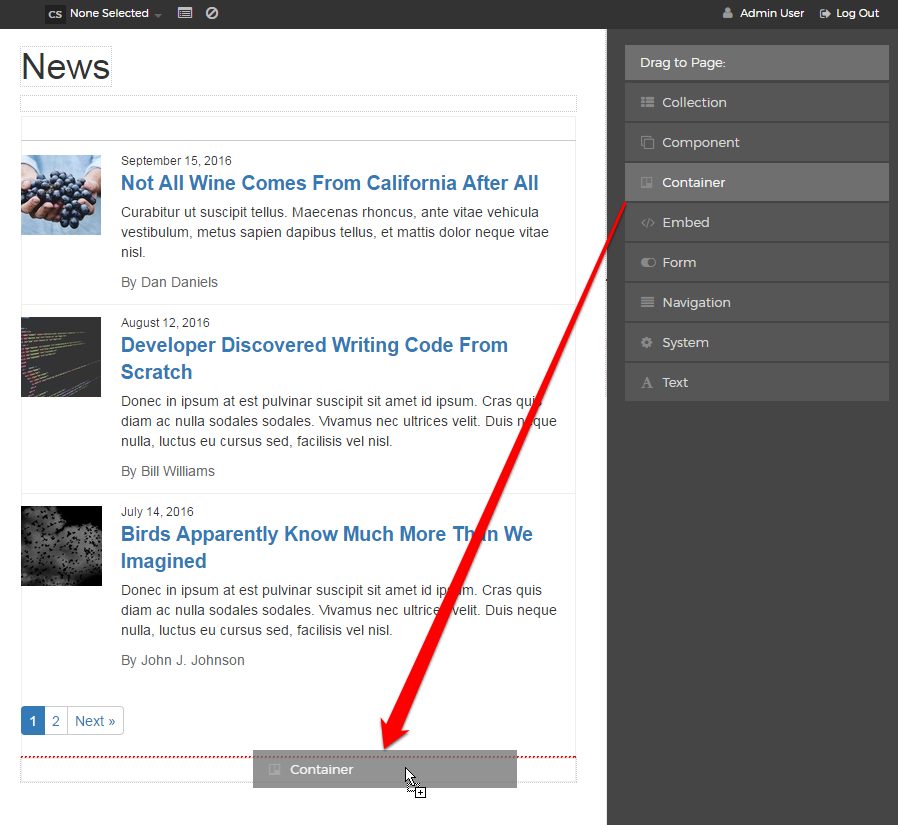
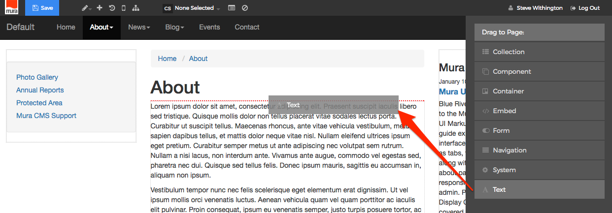
  3. Select the Collection display object, and then drag it to your desired area, such as above the main content region. As you drag the display object, drop zone target areas will highlight with either a red dotted box or red dotted line.
  4. When you release the mouse button, the display object should appear on your screen, and the inline edit panel should display a form with configuration options. Additional options may appear depending on the selections made to various form elements.
    • Content Source
      You will need to select a "Content Source" from one of the options listed below:
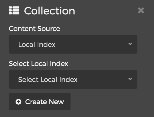
      • Local Index
        • Selecting the "Local Index" option will reveal the "Select Local Index" menu. Simply select your desired Local Index from the list, or click the "Create New" button to create a brand new Local Index
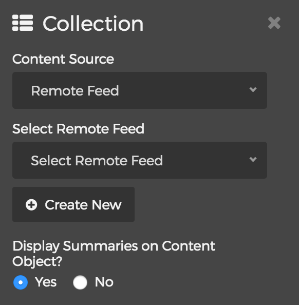
      • Remote Feed
        • Selecting the "Remote Feed" option will reveal the "Select Remote Feed" menu. Simply select your desired Remote Feed, or click the "Create New" button to create a brand new Remote Feed.
        • You can also choose whether or not you wish to "Display Summaries on Content Object?"
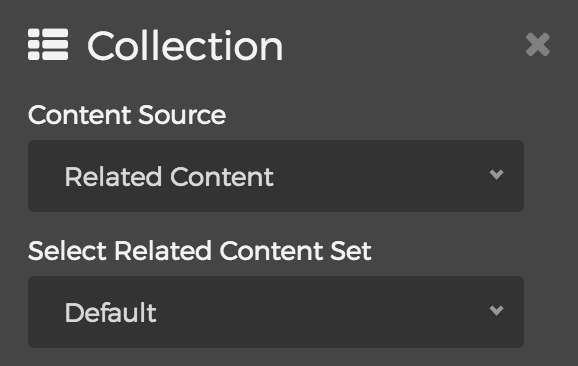
      • Related Content
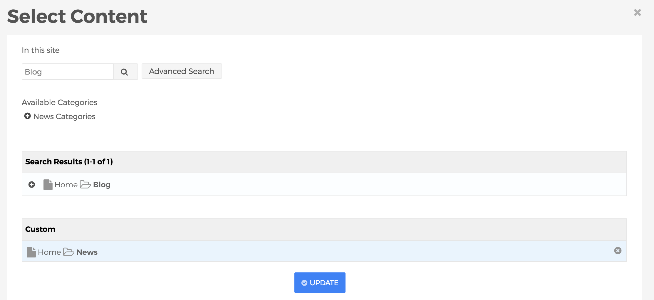
        • Selecting the "Related Content" option will reveal the "Select Related Content Set" menu. You can choose any defined Related Content Sets, or select "Custom" and then click the "Edit" button to build a custom Related Content Set specifically for this display.
    • Layout
      The layouts listed below are merely the predefined options which ship with Mura CMS. Your options may vary if a developer has created additional options for your specific site.
      • Default
        See "List" below
      • Custom
        Displays content items based on a "custom" layout option created by a developer. This is just an example layout that ships with Mura CMS for developers to use as a starting point.
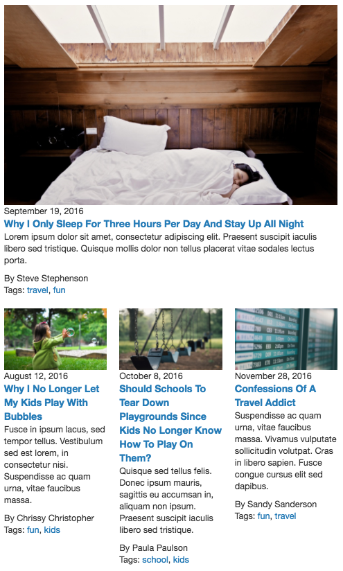
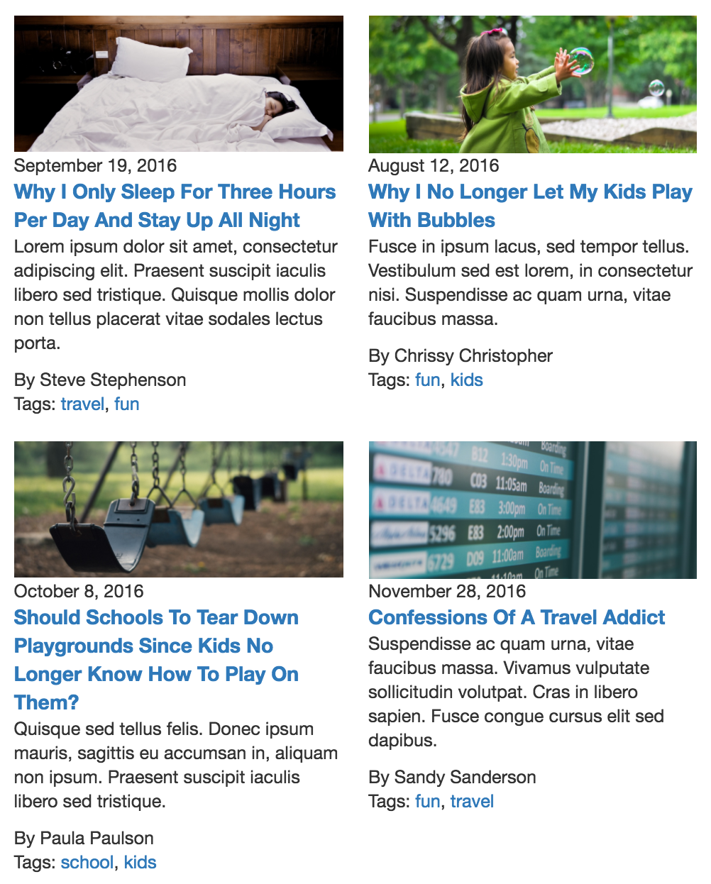
      • Grid
        Displays content items as a "grid." You can also select the "Grid Style" by choosing anywhere from 1 Column through 9 Column options.
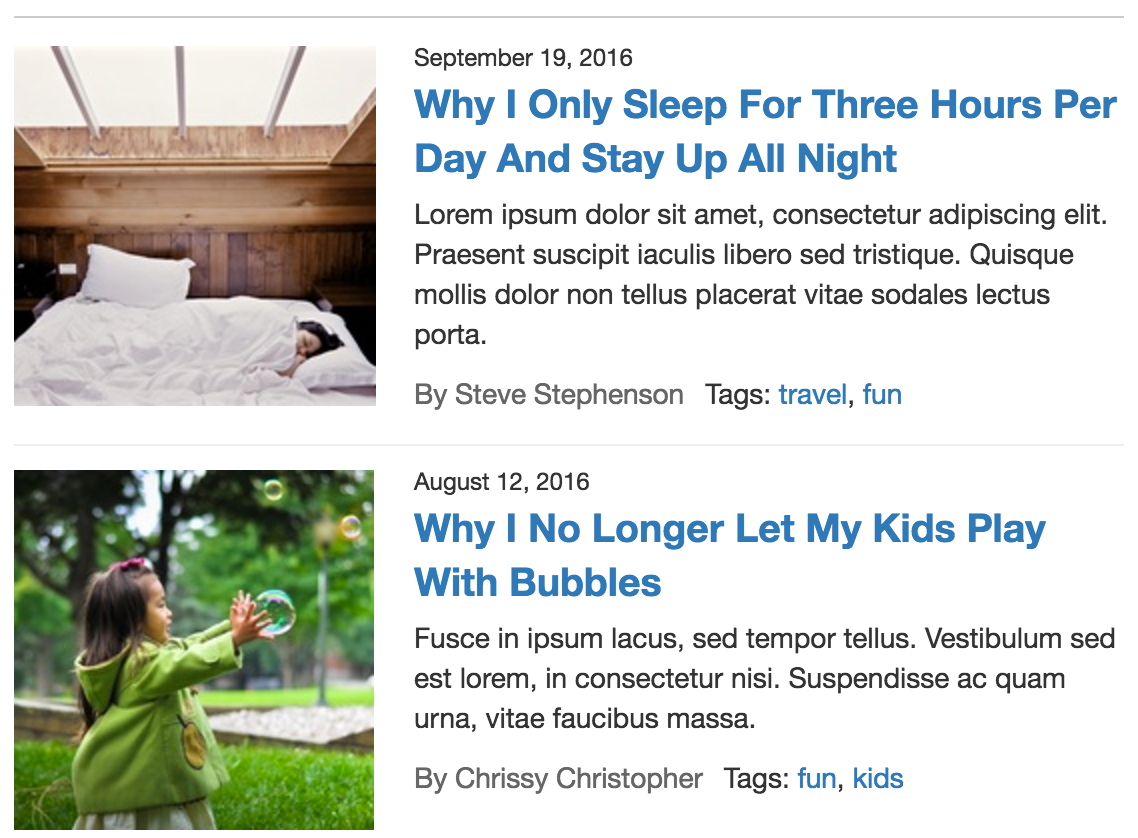
      • List
        Displays content items as a "list"
    • List Image Size
      • You can select from the available options of small, medium, large, custom, or any other pre-defined image sizes to control the size of the image to be displayed in the listing of content, assuming "Image" is selected as one of the fields to display.
    • Selected Fields
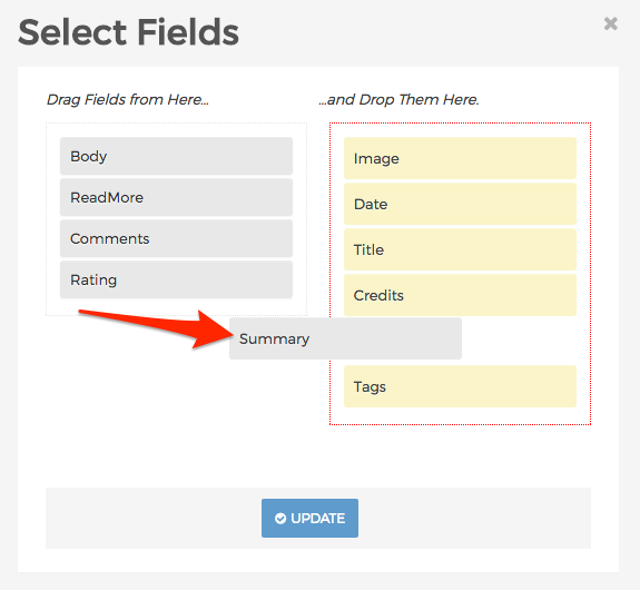
      • This section of the form controls which elements of the content item will display in the listing. Click the "Edit" button to launch the "Select Fields" dialog window.
      • Here, you can add and/or remove and rearrange fields you wish (or don't wish) to display in the listing. When finished making your selections. Click Update to save your options. The selected fields will now appear on the form. Click and drag any of the fields in the list to reorder them as you wish.
      • As you release the mouse click, the display object will dynamically update to reflect your changes.
    • View Images as Gallery
      Options are True and False:
      • True:  When a user clicks an image, a "Large" version of the image will open in a modal window.
      • False: When a user clicks an image, it will be treated like a regular link and the user will be taken to the content item's URL.
    • View All Link
      • You can enter a custom URL for a user to be directed to when they click the "View All" link
    • View All Label
      • If you don't like the standard "View All" label for the "View All" link, you can enter your own here.
    • Max Items
      • This controls the maximum number of items to display.
    • Items Per Page
      • This controls the number of items to display before pagination kicks in.
    • Label
      Enter the name for the new container.
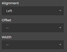
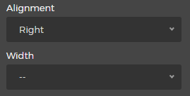
    • Alignment
      You may select an "Alignment" from one of the options listed below:
      • Left
        • Selecting the "Left" option will reveal the "Offset" and "Width" menus. Simply select your desired Offset and Width.
      • Right
        • Selecting the "Right" option will reveal the "Width" menu. Simply select your desired Width.
    • Custom CSS Classes
      Enter the name of the custom CSS class.
    • Select the Delete button to remove the Collection from the layout.
  5. When you're done making edits, select your desired publishing option to save your changes.

Component

Components are reusable content objects that can be shared across multiple pages or sections within your site. To learn more about Components, visit the Components section.

Follow the steps below to apply a Component as a display object to a page or section of your site.

  1. From the front-end public view of your site, hover over the pencil icon on the front-end toolbar and select Inline Edit.
  2. The inline edit panel should appear on the right-hand portion of your browser.
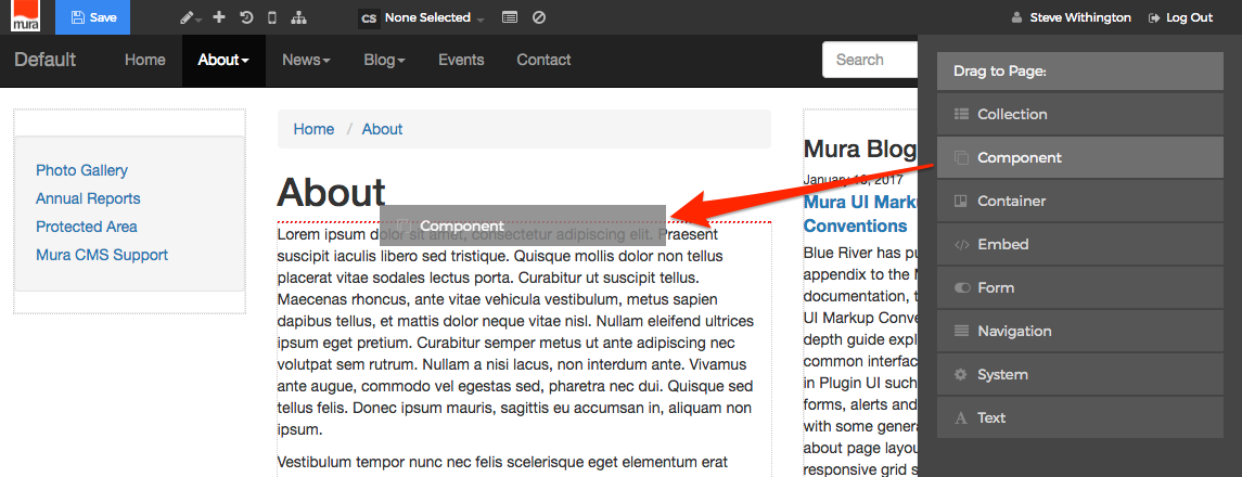
  3. Select the Component display object, and then drag it to your desired area, such as the right-hand column. As you drag the display object, drop zone target areas will highlight with either a red dotted box or red dotted line.
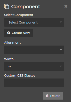
  4. When you release the mouse button, the display object should appear on your screen, and the inline edit panel should display a form with configuration options.
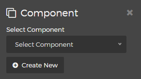
    • Select Component
      You will need to select a "Component" from the options listed below:

      Simply select your desired Component from the list, or click the "Create New" button to create a brand new Component.
    • Alignment
      You may select an "Alignment" from one of the options listed below:
      • Left
        • Selecting the "Left" option will reveal the "Offset" and "Width" menus. Simply select your desired Offset and Width.
      • Right
        • Selecting the "Right" option will reveal the "Width" menu. Simply select your desired Width.
    • Custom CSS Classes
      Enter the name of the custom CSS class.
  5. Select the Delete button if you wish to remove the Component from the layout.
  6. When you're done making edits, select your desired publishing option to save your changes.

Container

A "Container" allows you to add a division (<div>) or section to a page or portion of your site to group additional display objects. Hence, you can then include additional display objects within the container itself.

Follow the steps below to apply a Container to a page or section of your site.

  1. From the front-end public view of your site, hover over the pencil icon on the front-end toolbar and select Inline Edit.
  2. The inline edit panel should appear on the right-hand portion of your browser.
  3. Select the Container display object, and then drag it to your desired area, such as the right-hand column. As you drag the display object, drop zone target areas will highlight with either a red dotted box or red dotted line.
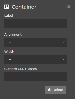
  4. When you release the mouse button, the display object should appear on your screen, and the inline edit panel should display a form with configuration options.
    • Label
      Optionally enter a label to appear above the Container.
    • Alignment
      You may select an "Alignment" from one of the options listed below:
      • Left
        • Selecting the "Left" option will reveal the "Offset" and "Width" menus. Simply select your desired Offset and Width.
      • Right
        • Selecting the "Right" option will reveal the "Width" menu. Simply select your desired Width.
    • Custom CSS Classes
      Enter the name of the custom CSS class.
    • Select the Delete button if you wish to remove the Container from the layout.
  5. When you're done making edits, select your desired publishing option to save your changes.

Embed

An "Embed" display object allows you to enter custom "embed" code into a page or section of your site. For example, maybe you want to "embed" a video from a third-party hosting service such as YouTube or Vimeo. Sites like these often allow you to copy "embed" code specifically for this purpose. However, videos aren't the only type of content you might want to "embed" into your site, as the options for embedding content from third-party sites is endless.

Follow the steps below to apply an Embed display object to a page or section of your site.

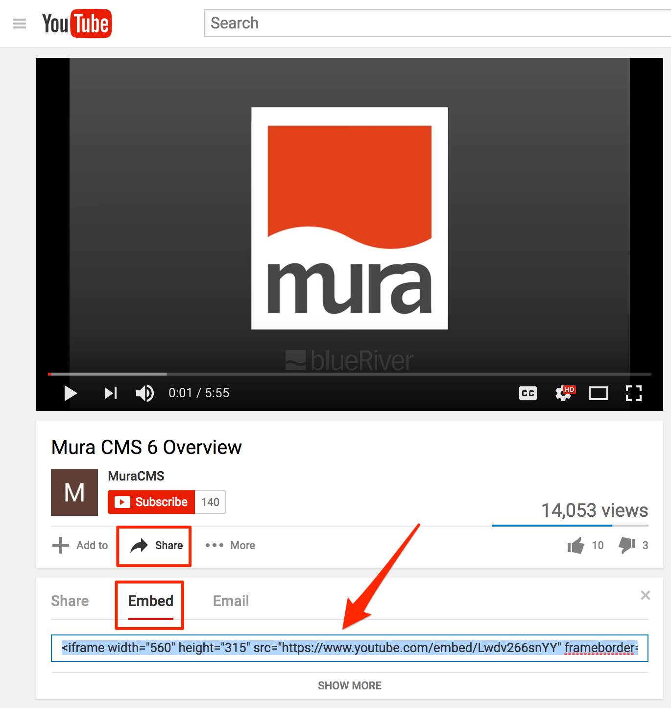
  1. First, you will need to obtain the "embed" code from your desired third-party site. In this example, we'll use YouTube's "Share" and "Embed" options for a Mura CMS video:
  2. Be sure to copy the "Embed" code, and perform the following steps below.
  3. From the front-end public view of your site, hover over the pencil icon on the front-end toolbar and select Inline Edit.
  4. The inline edit panel should appear on the right-hand portion of your browser.
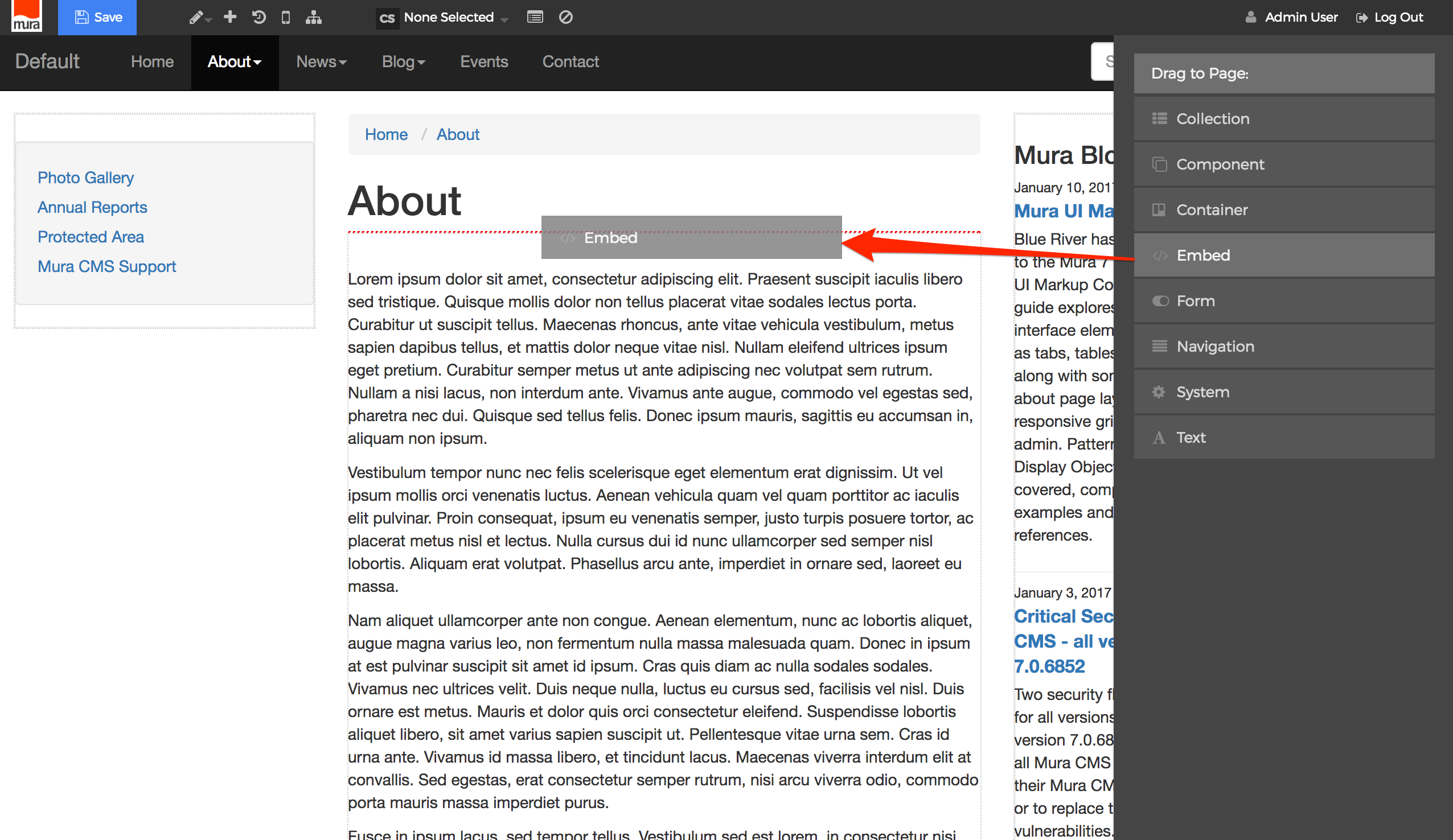
  5. Select the Embed display object, and then drag it to your desired area, such as above the main content area. As you drag the display object, drop zone target areas will highlight with either a red dotted box or red dotted line.
  6. When you release the mouse button, the display object configurator should appear on the right-hand portion of your screen, and the inline edit panel should display a form with configuration options.
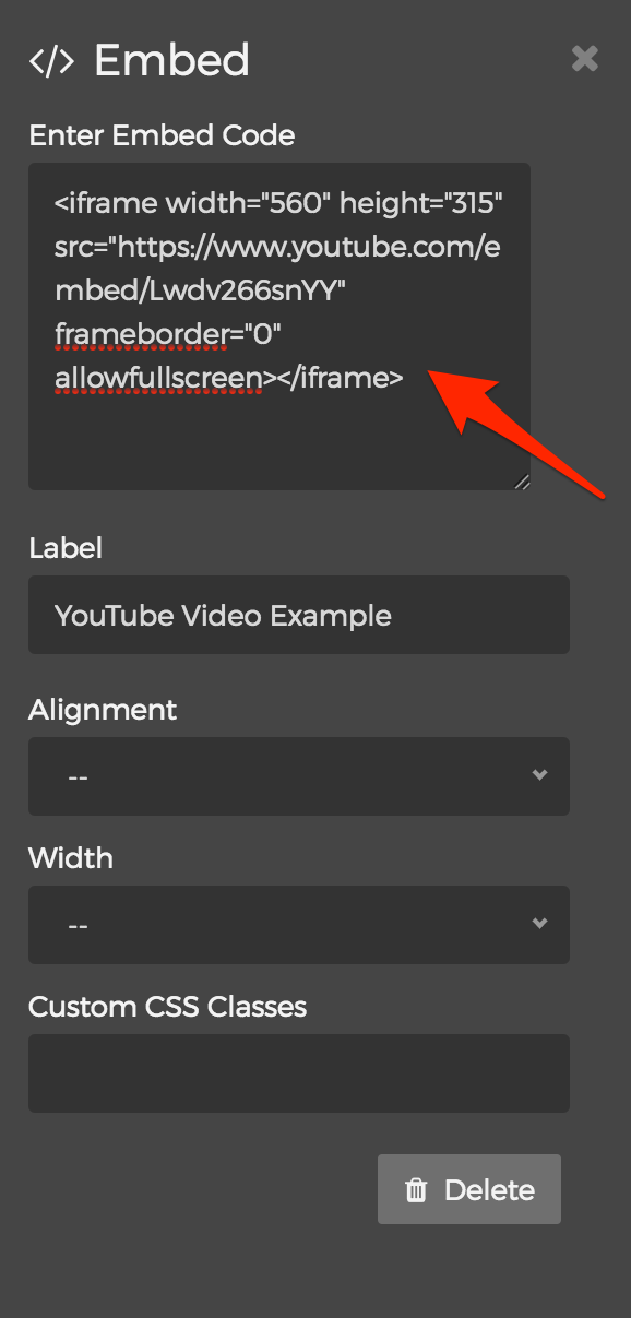
  7. Paste the copied "embed" code
    • Enter Embed Code
      Copy the "embed" code of the object such as a video and paste it into this field.
    • Label
      Enter the name for the new container.
    • Alignment
      You may select an "Alignment" from one of the options listed below:
      • Left
        • Selecting the "Left" option will reveal the "Offset" and "Width" menu options. 
        • Simply select your desired Offset and Width.
      • Right
        • Selecting the "Right" option will reveal the "Width" menu options. 
        • Simply select your desired Width.
    • Custom CSS Classes
      Enter the name(s) of any desired custom CSS class(es).
  8. When you're done making edits, select your desired publishing option to save your changes.
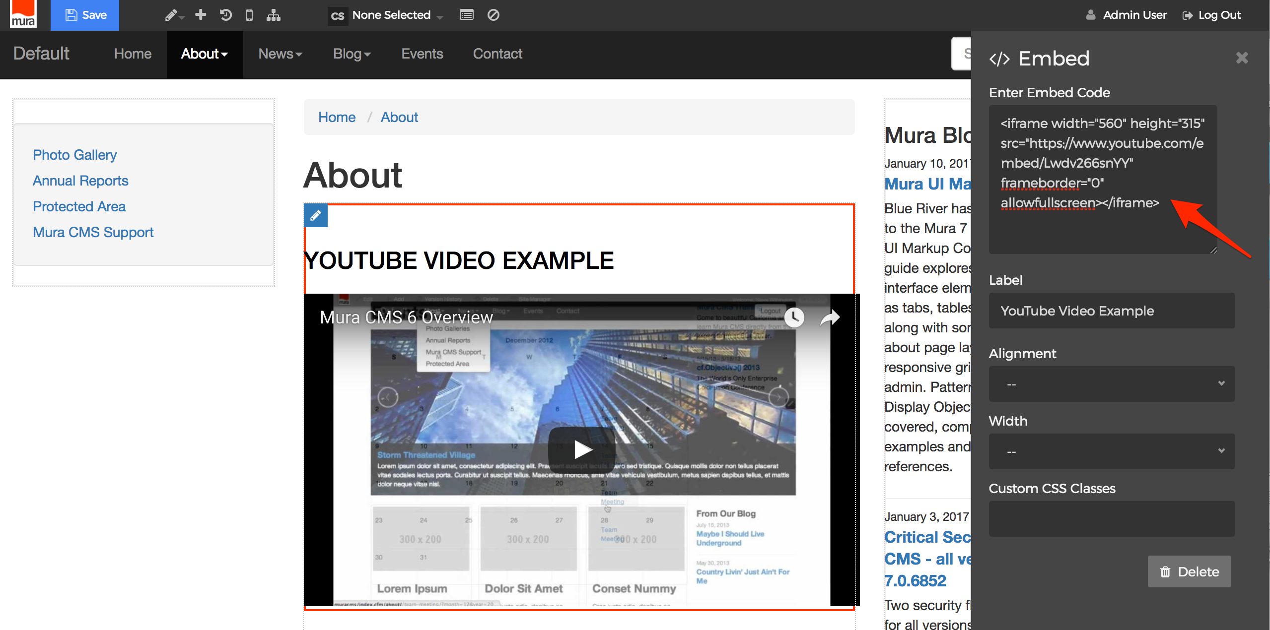
  9. Below is an example using the "Share" and "Embed" code for an older Mura CMS YouTube video:

Form

You can easily add a Mura Form to a page or section of your site. To learn more about Mura Forms, visit the Forms section.

Follow the steps below to apply a Mura Form as a display object.

  1. From the front-end public view of your site, hover over the pencil icon on the front-end toolbar and select Inline Edit.
  2. The inline edit panel should appear on the right-hand portion of your browser.
  3. Select the Form display object, and then drag it to your desired area, such as above the main content area. As you drag the display object, drop zone target areas will highlight with either a red dotted box or red dotted line.

     
  4. When you release the mouse button, the display object should appear on your screen, and the inline edit panel should display a form with configuration options.
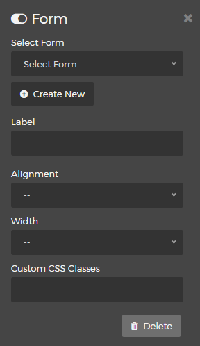
    • Select Form
      Choose your  desired "Form" from the available menu options:

      Simply select your desired Form from the list, or click the "Create New" button to create a brand new Form.
    • Alignment
      You may select an "Alignment" from one of the options listed below:
      • Left
        • Selecting the "Left" option will reveal the "Offset" and "Width" menus. Simply select your desired Offset and Width.
      • Right
        • Selecting the "Right" option will reveal the "Width" menu. Simply select your desired Width from the list of available options.
    • Custom CSS Classes
      Enter the name of the custom CSS class.
    • Select the Delete button if you wish to remove the Form from the layout.
  5. When you're done making edits, select your desired publishing option to save your changes.

Navigation

Mura offers a variety of Navigation display objects which can easily be added to a page or section of your site.

Follow the steps below to apply a Navigation display object.

  1. From the front-end public view of your site, hover over the pencil icon on the front-end toolbar and select Inline Edit.
  2. The inline edit panel should appear on the right-hand portion of your browser.
  3. Select the Navigation display object, and then drag it to your desired area, such as the left-hand column. As you drag the display object, drop zone target areas will highlight with either a red dotted box or red dotted line.
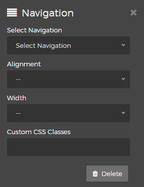
  4. When you release the mouse button, the display object should appear on your screen, and the inline edit panel should display a form with configuration options.
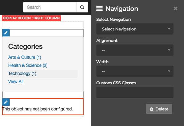
    • Select Navigation
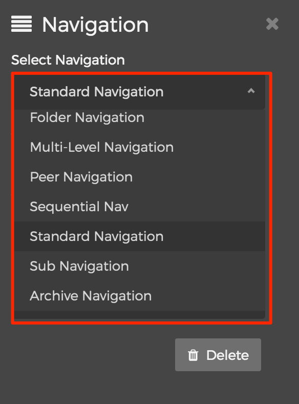
      Select your desired "Navigation" option:

      Simply select your desired Navigation option from the list. "Standard Navigation" is usually a safe bet when you're unsure.
    • Alignment
      You may select an "Alignment" option:
      • Left
        • Selecting the "Left" option will reveal the "Offset" and "Width" menus. Simply select your desired Offset and Width.
      • Right
        • Selecting the "Right" option will reveal the "Width" menu. Simply select your desired Width.
    • Custom CSS Classes
      Enter the name of the custom CSS class.
    • Select the Delete button if you wish to delete the Navigation from the layout.
  5. When you're done making edits, select your desired publishing option to save your changes.

System

There are a variety of baked-in "System" display objects in Mura CMS including: Comment Form, Content Rater, Site Map, User Favorites, and User Tools.

Follow the steps below to apply a System display object to a page or section of your site.

  1. From the front-end public view of your site, hover over the pencil icon on the front-end toolbar and select Inline Edit.
  2. The inline edit panel should appear on the right-hand portion of your browser.
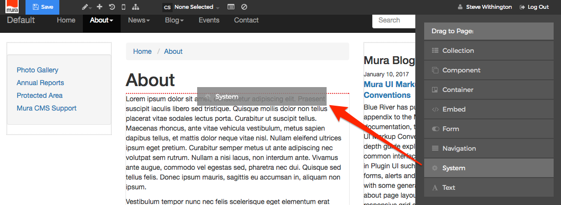
  3. Select the System display object, and then drag it to your desired area, such as the right-hand column. As you drag the display object, drop zone target areas will highlight with either a red dotted box or red dotted line.
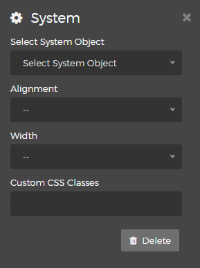
  4. When you release the mouse button, the display object should appear on your screen, and the inline edit panel should display a form with configuration options.
    • Select System Object
      Choose a "System Object" from the options listed below:
      • Comment Form
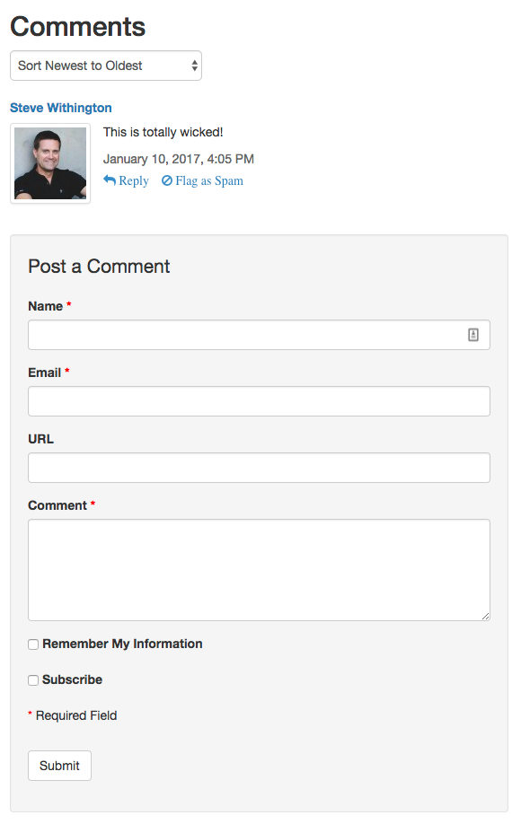
        The "Comment Form" display object allows end users to add comments to content items within your site. This is especially useful for sections of your site such as "News" or "Blog" areas. If you apply Comment Form to a Folder content type, the form will not appear on the Folder itself, and will only appear on the child content items within that section of the site.
        Note: If you don't see the "Comment Form" display object listed as an option, an administrator will have to review the Comments Permissions section.
      • Content Rater
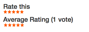
        A "Content Rater" allows end users to "rate" the content on a scale of five stars. Mura CMS tallies all ratings, and will display the "Average Rating" and total votes cast for the content item.
        Note: Content Raters are typically applied to a "Folder" content type so that the "rater" itself will appear on all of the children of the Folder. It will NOT display on the Folder itself, since these content types are typically used as "News" or "Blog" landing pages, and the landing pages (or Folders) aren't typically "rated" by users. This can be somewhat confusing because the Content Rater is "invisible" on the Folder when applied in this manner, yet "visible" on its children.
      • Site Map
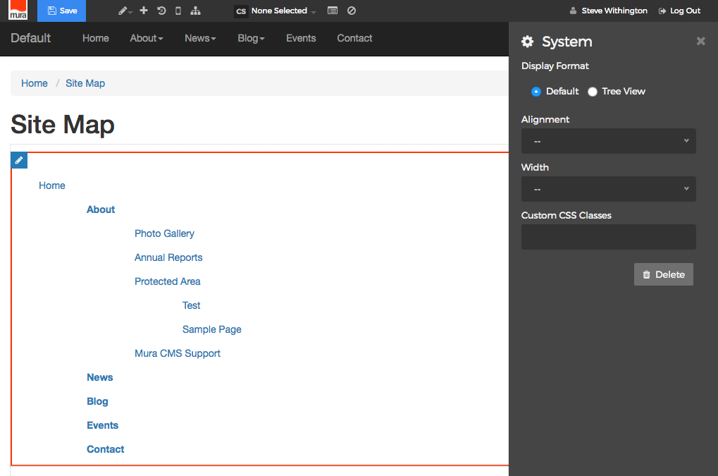
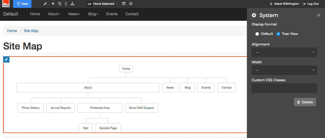
        Mura CMS can display an auto-generated listing of content items within your site in two different formats: Default and Tree View.
        • Default
          The "Default" display format of the Site Map is essentially an unordered list, where child content is indented within the list.
        • Tree View
          The "Tree View" display format of the Site Map attempts to show the content items in a hierarchical structured view. 
      • User Favorites
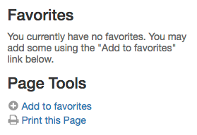
        The "User Favorites" display object gives logged in users the ability to add content items to a list of their favorite pages so they can quickly and easily access these pages or areas of the site. Users also have an easy link to print the page they're currently viewing.

        If a user is not logged in, they will be prompted to log in to use the display object.
      • User Tools
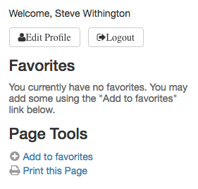
        The "User Tools" display object is nearly identical to the "User Favorites" display object, except it also includes links to "Edit Profile" and "Logout" along with a welcome message.
    • Alignment
      You will need to select an "Alignment" from one of the options listed below:
      • Left
        • Selecting the "Left" option will reveal the "Offset" and "Width" menus. Simply select your desired Offset and Width.
      • Right
        • Selecting the "Right" option will reveal the "Width" menu. Simply select your desired Width.
    • Custom CSS Classes
      Enter the name of the custom CSS class.
    • Select the Delete button if you wish to to remove the System display object from the layout.
  5. When you're done making edits, select your desired publishing option to save your changes.

Text

You can add a text object very easily to a page or section of your site.

Follow the steps below to apply a Text display object.

  1. From the front-end public view of your site, hover over the pencil icon on the front-end toolbar and select Inline Edit.
  2. The inline edit panel should appear on the right-hand portion of your browser.
  3. Select the Text display object, and then drag it to your desired area, such as the right-hand column. As you drag the display object, drop zone target areas will highlight with either a red dotted box or red dotted line.

     
  4. When you release the mouse button, the display object should appear on your screen, and the inline edit panel should display a form with configuration options.
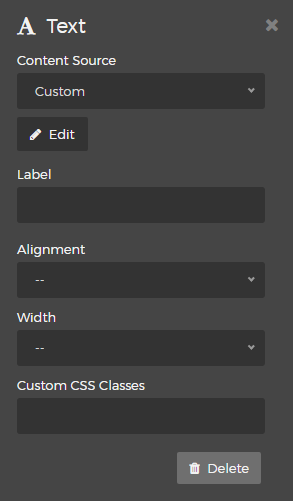
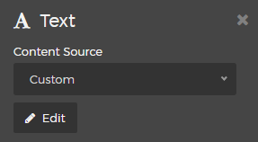
    • Select Content Source
      There are two options for "Content Source": Custom, and Bound Attribute.
      • Custom
        • Select "Custom" and click "Edit"
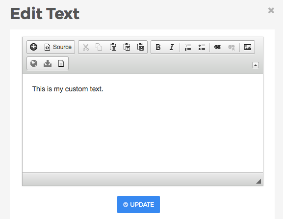
        • You should now see an "Edit Text" window which contains a simplified HTML editor toolbar for basic formatting of your text. Simply enter your text, style it, and click "Update" to save.
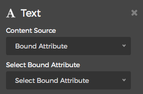
      • Bound Attribute
        • Selecting "Bound Attribute" will reveal an additional menu option titled "Select Bound Attribute." Options include: Navigation Title, Title, Credits, Summary, and any custom fields created through Mura's Class Extension module.
        • When you select an attribute, the value will simply display on the layout wherever you've applied the display object.
    • Label
      You may optionally enter text for a label which would appear above the text.
    • Alignment
      You may select an "Alignment" from one of the options listed below:
      • Left
        • Selecting the "Left" option will reveal the "Offset" and "Width" menus. Simply select your desired Offset and Width.
      • Right
        • Selecting the "Right" option will reveal the "Width" menu. Simply select your desired Width.
    • Custom CSS Classes
      Enter the name of the custom CSS class.
    • Select the Delete button to remove the Text display object from the layout.
  5. When you're done making edits, select your desired publishing option to save your changes.

Managing Navigation Menus

Mura CMS auto-generates hierarchical navigational elements based on the way content is structured, and sorted in the back-end administration area's Content Tree View.

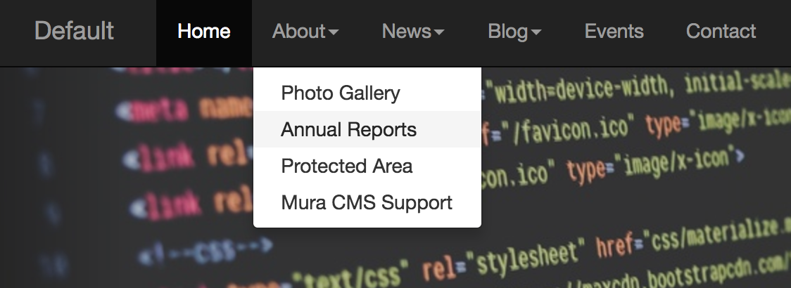
For example, content items located immediately below the "Home" page may have a link auto-generated to it in the "Primary Navigation" area of the public-facing site. Only content items with "Nav (Display in Navigation)" set to "Yes" and "Display" set to "Yes" or if the current date falls within the schedule set under "Per Schedule" will be displayed to end users.

In the above photo, you'll notice a link to "Site Map" and some of the other content items listed in the prior image don't appear in the primary navigation because the content items have either the "Nav" or "Display" options set to "No." This concept applies anywhere navigational elements are generated by Mura CMS.

In this section, you'll learn how to add navigational elements such as sub-navigation, to a specific region on the page, reorganize content items, as well as how to edit the navigation and menu items.

Adding Navigation to Content

Mura CMS includes several different types of navigational aids which can be applied to your site. The general concepts on applying navigational elements to your layout are covered under the Navigation section of Layout Manager Modules section.


Reorganizing Content Items

This section covers the sorting and ordering options for navigational elements, including how to manually re-order content items within the back-end administration area.

Sorting Content Items

As mentioned in the Managing Navigation Menus section, Mura CMS auto-generates hierarchical navigation based on the way content is structured, and sorted in the back-end administration area's Content Tree View

For example, content items located immediately below the "Home" page may have a link auto-generated to it in the "Primary Navigation" area of the public-facing site. Only content items with "Nav (Display in Navigation)" set to "Yes" and "Display" set to "Yes" or if the current date falls within the schedule set under "Per Schedule" will be displayed to end users.

In the above photo, you'll notice a link to "Site Map" and some of the other content items listed in the prior image don't appear in the primary navigation because the content items have either the "Nav" or "Display" options set to "No." This concept applies anywhere navigational elements are generated by Mura CMS.

Modify View

From the Content Tree View, just above, and to the right of the content listing area, you should see a "Modify View" button.

Clicking this button will reveal a number options which vary based on which section of the site you're currently "zoomed" in to. For example, if you're completely zoomed out to the "Home" view, clicking the "Modify View" button will only reveal an option to change the number of rows display.

Note: For larger sites, Administrators may change the default number of rows to display (from 20) by going to Site Settings > Edit Site, and updating the "Default Rows (in Site Manager)" field. Content managers will have to log out, and log back in for the new setting to take effect.

The only way to sort "top level" content items, located directly beneath the "Home" content item, is manually using the "Drag and Drop" method. To learn how to manually sort content items, please visit the Manually Sorting Content with Drag & Drop section.

Once "zoomed" into a specific section of the site, by clicking the three-dot menu icon and selecting "Zoom," "Sort Navigation" options will appear on the Modify View menu.

Sort Navigation Options

Listed below are the various options for sorting content items located below the "top level" content items. Please note these sorting options only apply to the direct children of the section you are applying the sort options to. For example, if you sort by "Menu Title" in the "About Us" section, and you create a new section beneath that which contains its own child content, the new section will default to sorting "Manually" and have its own sorting options and capabilities.

  • Manual:
  • Official Release Date:
    • Sort the content items by the Official Release Date field, located the content item's Publishing tab.
  • Last Updated:
    • Sort by the date the content items were last updated.
  • Created:
    • Sort by the date content items were created.
  • Menu Title:
    • Sort content items by their Navigation Title, as found on the "Basic" tab, and selecting "Show Additional Titles."
  • Long Title:
    • Sort content items by their Title field, as found on the "Basic" tab.
  • Rating:
    • Sort content items by the "Content Rating" the content item has received from end users. To have higher rated content appear first, select "Descending" for the Sort Order.
  • Comments:
    • Sort content items by the number of comments the content item has received from end users.
  • Extended Attributes:
    • If your site has any custom class extensions, their extended attributes may also appear as potential sort options.

Once you have selected the sort criteria, you may choose to display the content items in either "Ascending", or "Descending" order.

Manually Sorting Content with Drag & Drop

The default Sort Navigation option for content items in Mura CMS is "Manual." In fact, top-level content, or content located immediately below the "Home" page, can only be sorted manually. Before attempting to sort content items manually, be sure the Sort Navigation is set to "Manual."

Follow the steps below to manually sort content items.

  1. First, you must use the Content Tree View to sort content items manually.
  2. Next, select the content item you wish to move by using a click, drag, and drop method. We recommend clicking between the three-dot menu and the content item title, then dragging it up or down, then releasing the mouse click when the item has reached its intended target area.
  3. It's important to understand that to manually reorder "children" of a specific section, you must first "zoom" into that specific section. In the prior example above, you'll notice that moving the "About" content item selects all of its children as well, and moves along with it. The same would occur if you attempt to select a child of the About section while zoomed out to the "Home" top-level view.
  4. Once you've finished manually re-ordering the content items, you must select the "Update" button from the notice that appears above the content listing to save the new sort order.The new sort order should now be reflected in your navigation menus on the front-end public-facing site.

Selecting New Parent

When you wish to move a content item to a new section of the site, you can quickly, and easily select a new "parent" for the content item. Follow the steps below to change a content item's parent, and move it to a completely different section of the site.

  1. Select a content item to edit. Note, if you're editing from the front-end public-facing view, be sure to select "Full Edit" option.
  2. Select the Basic tab from right-side menu on the Edit Content screen.
  3. Click the Select New Parent button to reveal a search box and Search button.
  4. Enter text into the search box and click the Search button to obtain a listing of content options. The first option in the list with the radio button selected is the current content parent. Simply select your newly desired option, and select your desired publishing option to save the new content parent.
  5. The content item, and all of its children, if any, should now be located under the new content parent.

Editing Navigation/Menu Titles

Sometimes, when you create a content item, you might want the text which appears for a link to be different than the actual title of the page. For example, you might have a page "Title" of "About Us." However, you would prefer any links to this page to simply output as "About" instead. Mura CMS offers a convenient and easy method to accomplish this.

Follow the steps below to edit a content item's title fields.

  1. Select a content item to edit. If editing content on the front-end public-facing view of your site, you will need to use "Full Edit" mode.
  2. Open the Basic tab on the right-side menu.
  3. There are several title options:
    • Title: The actual title of the page you are editing. The page title will display as the headline or title on a given page.
    • Navigation Title (optional): You may enter an optional, shorter, or completely different title to be used wherever Mura generates navigational links to this content item. If this field is left blank, Mura will auto-generate the text based on the information entered in the "Title" field.
    • URL Title (optional): Text entered here will display in the browser's address bar. If you choose to customize this field, be sure to use URL-friendly characters (e.g., use only alpha-numeric characters, etc.). If this field is left blank, Mura will auto-generate the text based on the information entered in the "Title" field, in a URL-friendly manner by replacing spaces and punctuation with hyphens, etc.
    • HTML (Browser) Title (Optional): Text entered here will appear in the browser's "chrome" or "tab" typically located above the address bar. If this field is left blank, Mura will auto-generate the text based on the information entered in the "Title" field.
  4. If you wish to update the "Title", if you press the spacebar while in the Title field, a notice with a button to "Clear Additional Titles" should appear.If you would like Mura to regenerate all of the additional title fields based on the new text entered, simply click the "Clear Additional Titles" button, and Mura will wipe out the old values, and then update those fields once you publish the content item.
  5. After making your desired changes, select your preferred publishing option to save your changes.

Mobile Navigation

You can control the display of a link generated by Mura based on whether or not a visitor is accessing the site from a "mobile" device. This is quite useful when you might want to display mobile-specific content, which may not necessarily apply to someone accessing your site from a non-mobile device, and vice versa.

Note: Mura does not consider tablets, such as iPads, as mobile devices since they typically have screen real estate and resolution capabilities on par with most desktop and laptop computers.

Follow the steps below to control the display of a link to a specific content item when a user is accessing the site from a mobile or non-mobile device.

  1. Select a content item to edit. If editing content on the front-end public-facing view of your site, you will need to use the "Full Edit" mode.
  2. Select the Publishing tab from the Edit Content screen.
  3. Scroll down to the Mobile Navigation section.
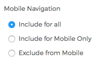
    • Include for all:
      • A link will be generated by Mura regardless of which device type the visitor is using.
    • Include for Mobile Only:
      • If a visitor is accessing the site from a mobile device, Mura will generate a link to this content item. Otherwise, it will not appear in any Mura generated navigational elements.
    • Exclude from Mobile: 
      • If a visitor is accessing the site from a non-mobile device (e.g., tablet, desktop, laptop, etc.), Mura will generate a link to this content item. Otherwise, it will not appear in any Mura generated navigational elements.
  4. After you've chosen your desired option, simply select your preferred publishing option to save your changes.

Note: Just because a link is not generated by Mura doesn't mean the content is not "visible" per se. If a visitor knows the URL to the content item, they could still technically enter that URL in their address bar to see the content. If you wish to completely hide content item altogether, use the "Display" filed located on the same tab.

Taxonomy

Mura CMS allows you to "categorize" and/or "tag" content in order to classify content so that users are able to search and/or filter content that's relevant to their own interests. Please refer to the sections below for details on the differences between the two options.

Categories

Mura CMS enables you to create a hierarchy of categories, and then assign content items to one or more of those categories. By categorizing content, you can create unique indexes, or collections, of content items that you can use throughout various sections of your site to highlight content. In addition, Mura CMS offers a built-in category filter as a display object that site visitors can use to drill down to content that might be of interest to them.

Creating Categories

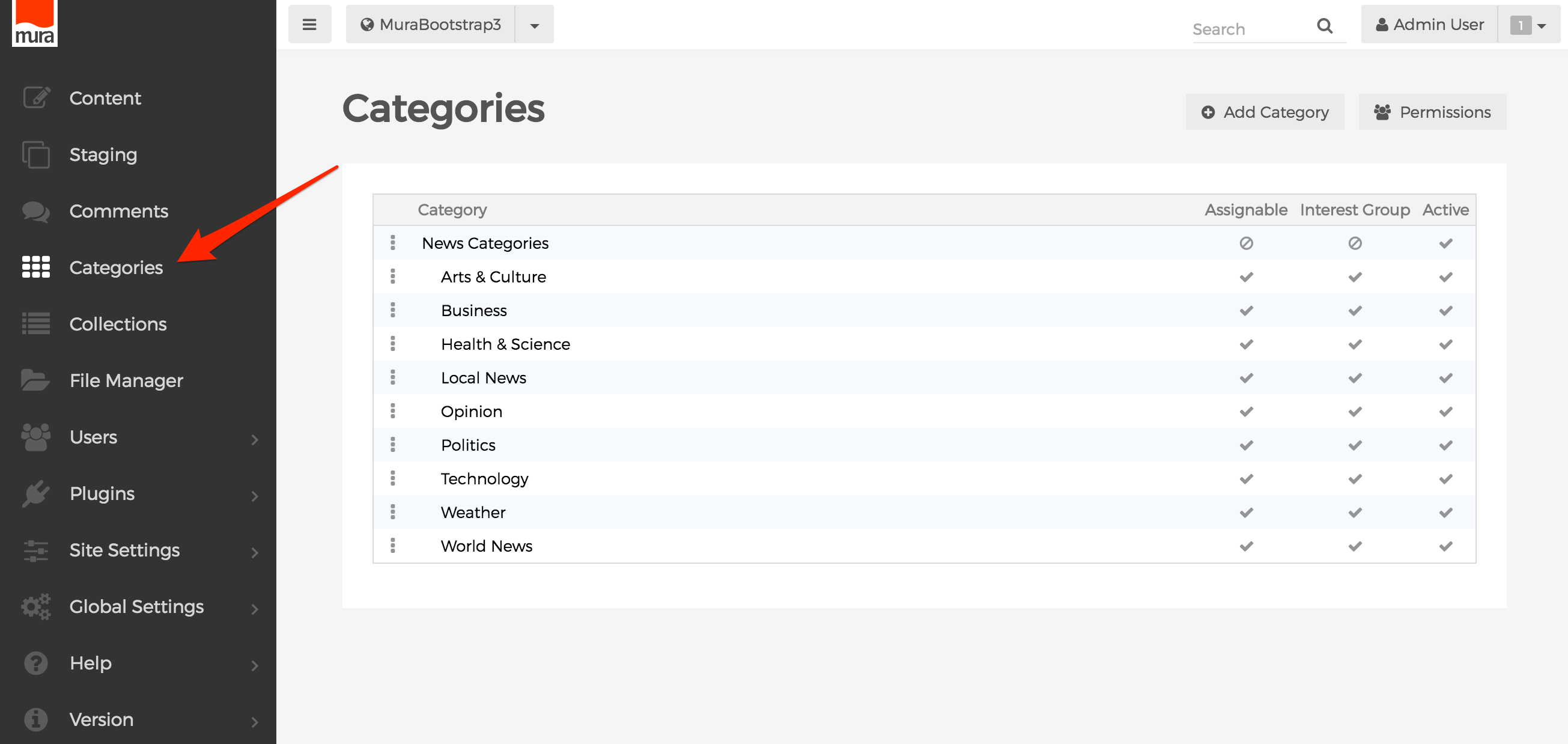
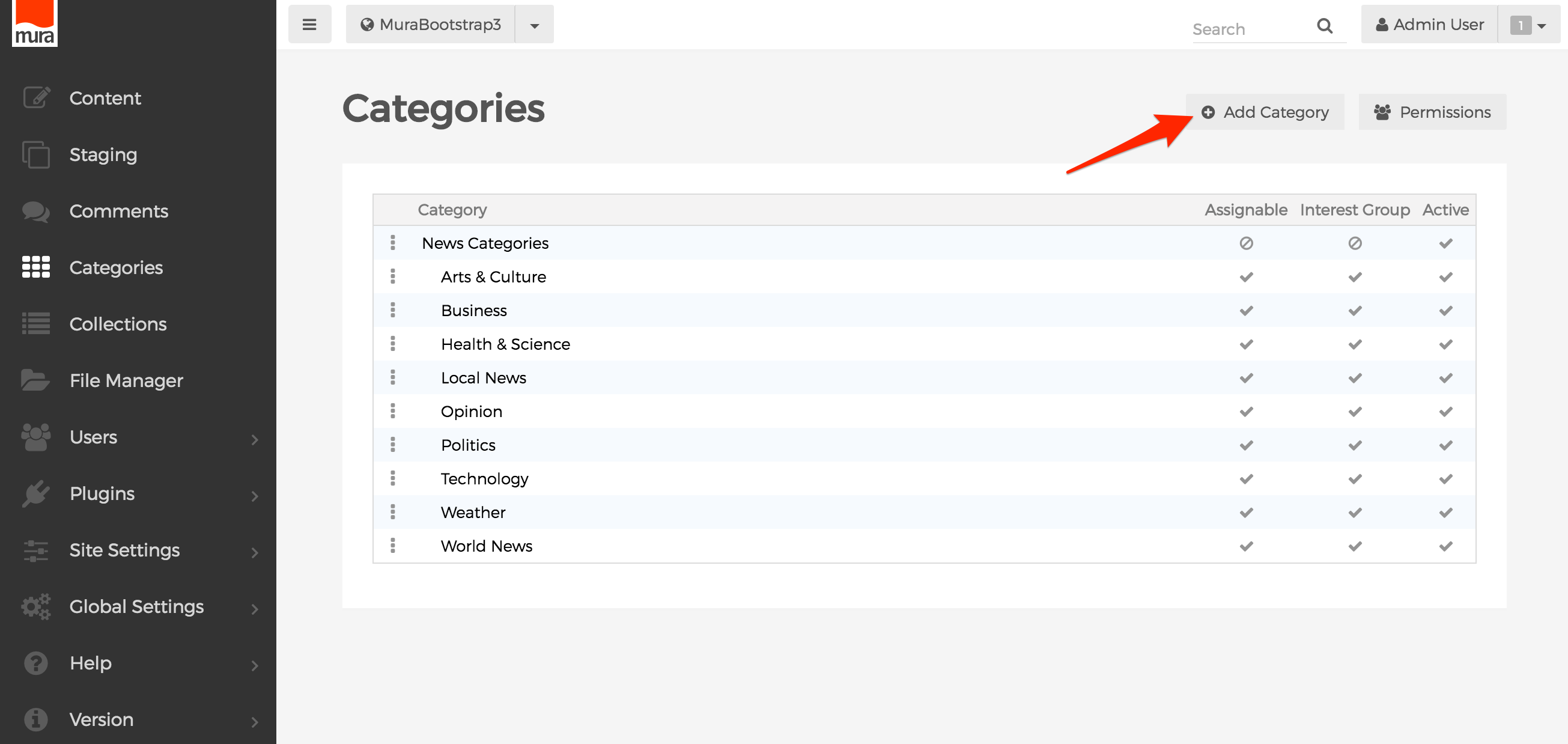
To create categories, you need to go to the Categories section of the back-end administrator and follow the instructions below.

  1. From the Categories section, select "Add Category"
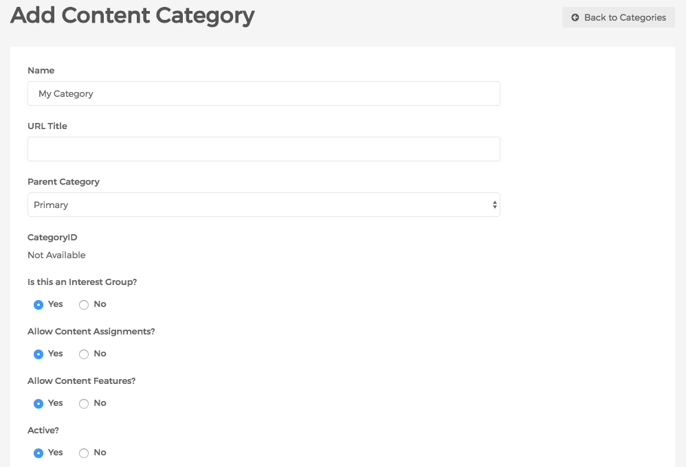
  2. You should now see the "Add Content Category" screen
    1. Name: This will be the name of the category
    2. URL Title: Leave this blank to have Mura automatically generate your category a URL title based on the name you chose. Or, feel free to enter your own unique URL title.
    3. Parent Category: The select menu will display all existing categories. If you prefer the category be assigned as a subcategory, simply select the desired parent category. Otherwise, select "Primary."
    4. Is this an interest group?: Select "Yes" to allow Site Members to choose it when completing/editing their profile.
    5. Allow Content Assignments?: If "Yes" then content can be assigned. If "No," it will simply show as a heading on the Categorization tab under "Available Categories. This is useful when you want to group some categories together, but not necessarily allow content to be categorized as such. For example, you might have a category called "News Categories" that contains several subcategories, and you wouldn't really want someone to assign content to this specific category.
    6. Allow Content Features?: If "Yes" the content can be featured under the specified category.
    7. Active?: If "Yes" then the category will appear as an option for content managers to assign content to, otherwise it will be hidden.
    8. Restrict ability to assign content to this category?: If utilized, only the group(s) selected will be allowed to assign content to this specific category.
    9. Notes: Enter any notes pertinent to the category, if desired. It's not used for any display purposes.
  3. Complete the fields as desired, then click "Add" to create your desired category.

Categorizing Content

Once you've created one or more categories, you can categorize your content by following the steps below.

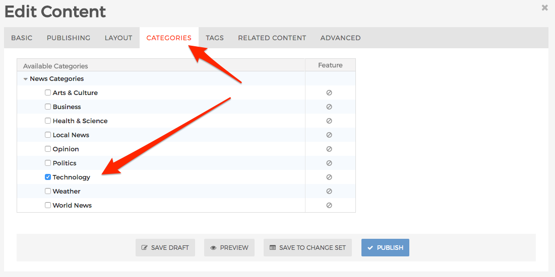
  1. Select a content item to edit.
  2. Select the "Categories" tab.
  3. Select one or more options from the list of available categories.
  4. Select your desired publishing option.
  5. Repeat these steps for any other content items you wish to categorize.
  6. Congratulations! You've successfully categorized content.

Feature Categorized Content

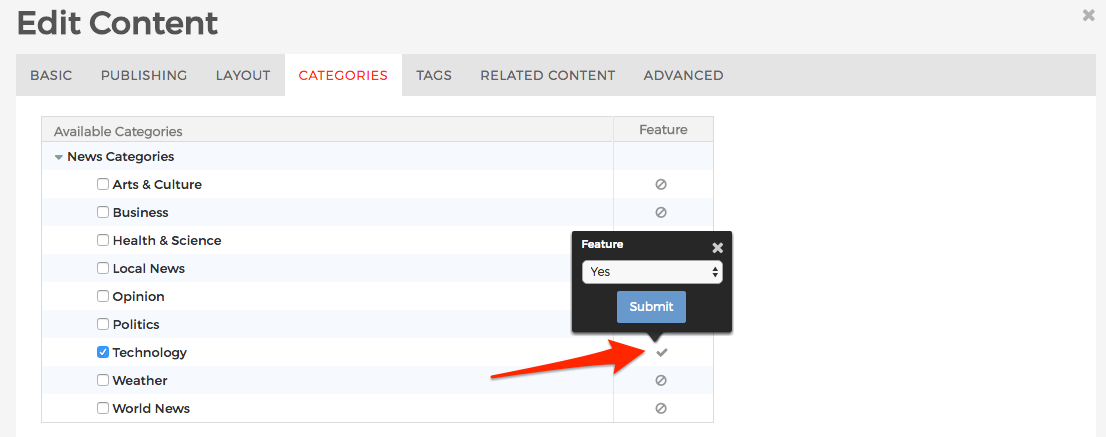
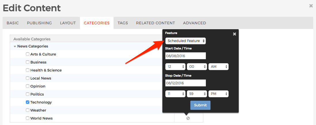
Sometimes, you'll want to feature one or more content items within one or more categories. Under the "Feature" column, click the icon to open the Feature quick edit popup.

  1. Select "No" and the content item will not be featured within the specified category.
  2. Select "Yes" and the content item will be included in a content collection/local index that is looking for "featured" content within that category.
  3. Selecting "Scheduled Feature" is the same as "Yes," except the content item will only be featured during the specified period of time.


Category Summary Display Object

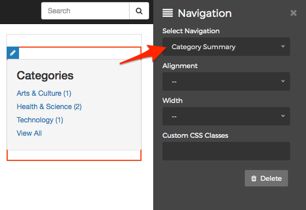
The Category Summary display object is a listing of categories used throughout the site, where each category listed contains a count of categorized content items and is hyperlinked to a search results page to display content items associated with the selected category.

Displaying a Category Summary

Category Summary display objects are typically applied to Mura Folder content types so that the display object will also appear on child content items, such as a "News" or "Blog section of a site. To display a Category Summary, follow the steps below.

  1. From the front-end public view of your site, select a content item to edit such as the "News" section, and from the front-end toolbar, hover over the pencil icon and select Inline Edit.
  2. The inline edit panel should appear on the right-hand portion of the browser.
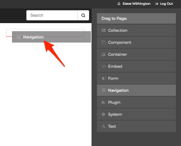
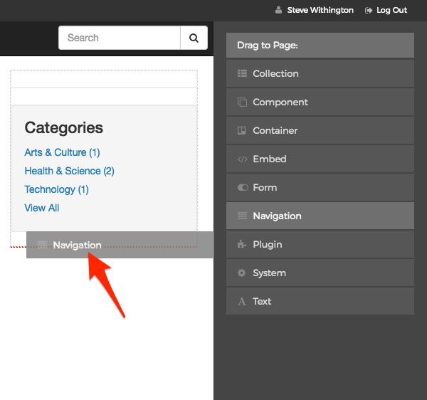
  3. Select the Navigation display object, and then drag it to your desired area, such as the right-hand column. As you drag the display object, drop zone target areas will highlight with either a red dotted box or red dotted line.
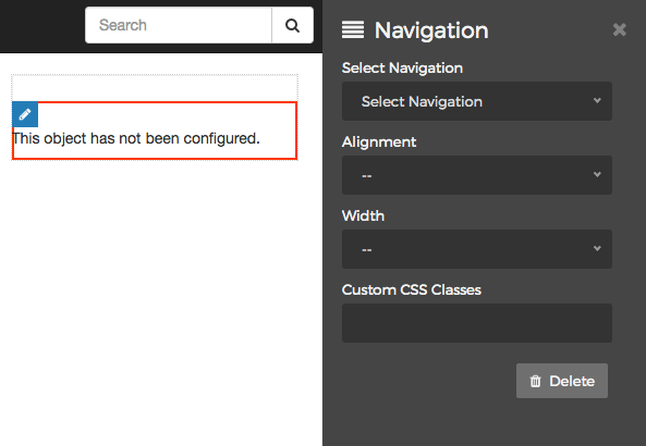
  4. When you release the mouse button, the display object should appear on your screen, and the inline edit panel should display a form with configuration options.
  5. Select "Category Summary" from the Select Navigation menu.
  6. When you're done making edits, select your desired publishing option to save your changes.

Tags

Mura CMS allows you to add free-form "tags" to content. A "tag" is a non-hierarchical keyword or term assigned to a piece of information. Tags are usually single words. This kind of metadata helps describe the item and allows it to be found again by browsing or searching. If a tagged content item is child of a Mura Folder, each tag may display, along with other summary information, and would be hyperlinked to other content items associated with that tag.

Tagging Content

Follow the steps below to add/edit content tags.

  1. Select a content item to edit. If you're editing content from the front-end public view, use "Full Edit" mode.
  2. Select the "Tags" tab.
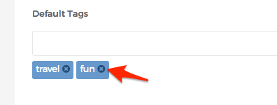
  3. If the content item you've selected has already been tagged, they will appear below the text box.
  4. If you want to delete/remove one of the existing tags, simply click the circle with an "x" in the middle of it just to the right of the existing tag.
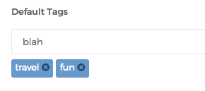
  5. If you want to add/create a tag, type the word into the text box, and hit "Enter" or "Return" on your keyboard.
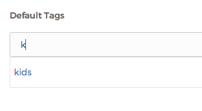
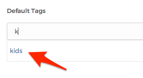
  6. As you type, Mura will display a list of tags that have already been used before that match the letters you're typing. So, for example, if you type a "k" into the text box, any tags that contain a "k" in it will appear below. Also, if you click the down arrow in the empty text box, a full listing of tags that have already been used will appear.
  7. If your desired tag appears in the list, simply click on it, and it will be added.
  8. When you're finished tagging your content, select your desired publishing option to save the content.
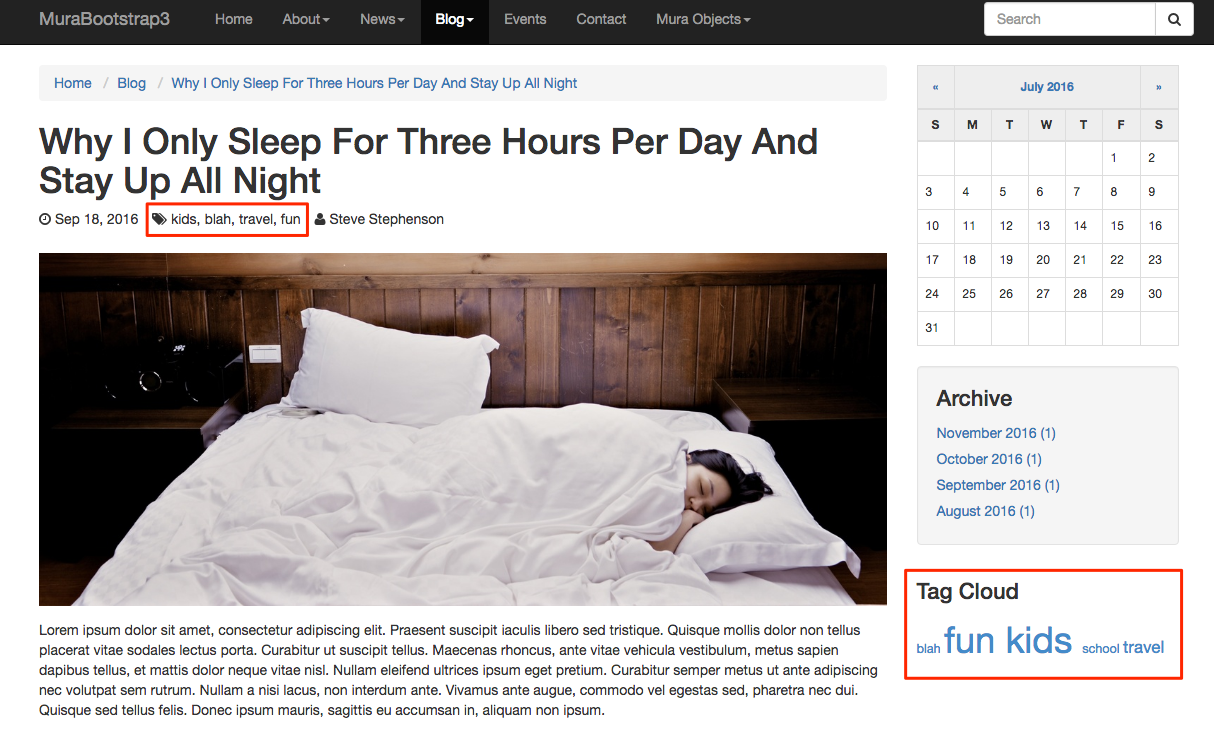
  9. Depending on how your layout templates were created, your tags may appear with your content. Visit the Tag Cloud Display Object section for more information.

Tag Groups

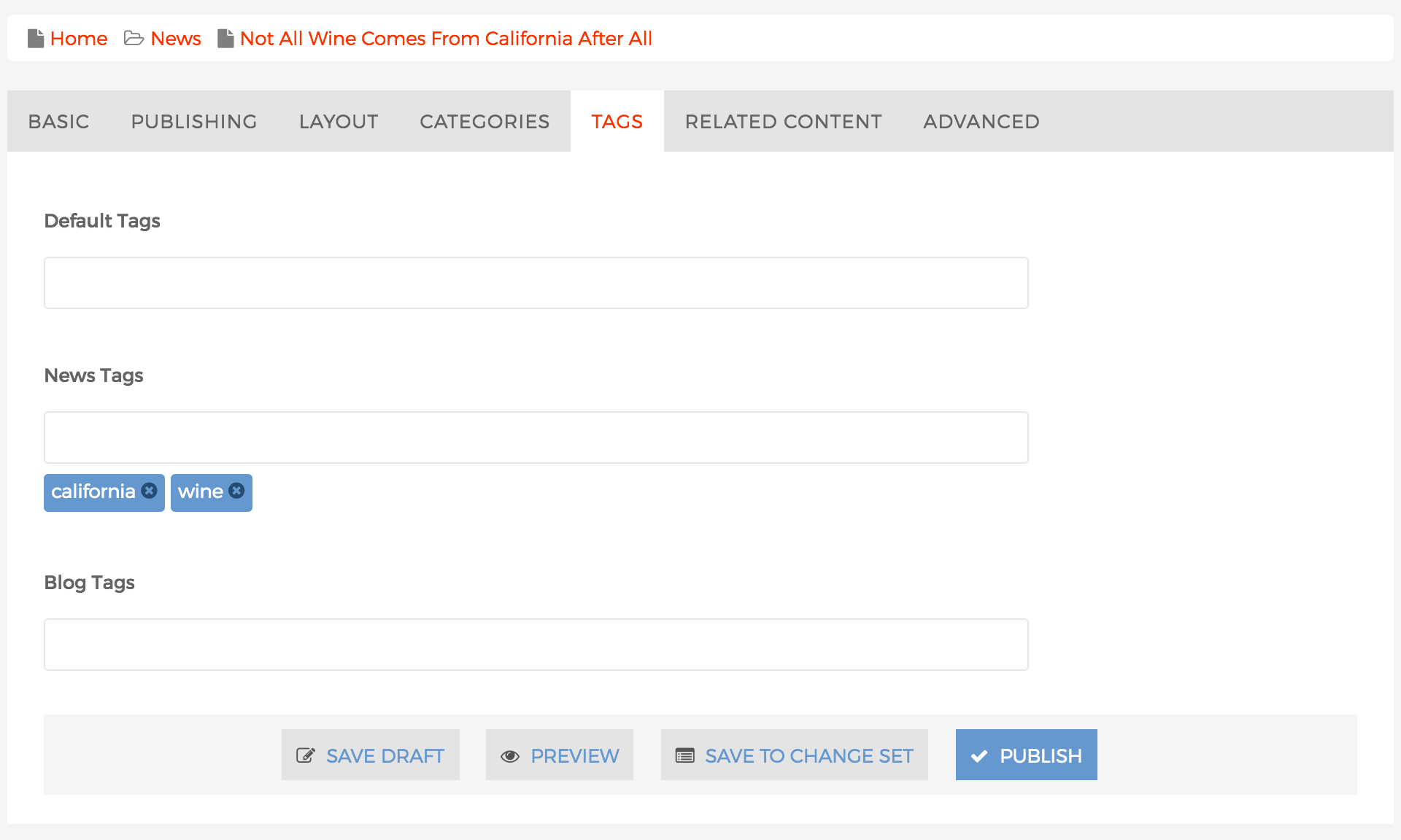
Tag Groups offer a way to apply tags to individual sections, such as "News Tags" or "Blog Tags." This will also allow for the ability to display a specific grouping of tags that only apply to a specific region of a site, for example.

Creating Tag Groups

To create tag groups, follow the steps below.

  1. Go to the back-end administration area
  2. Select Site Settings > Edit Settings
  3. On the Basic tab, scroll down to locate the Custom Tag Groups form field
  4. Enter your desired tag group names, separated by a carat (^) in between each group name
  5. Click Save Settings
  6. That's it!

Using Tag Groups

To use tag groups, follow the steps from Tagging Content to apply tags to content items, using the desired specific tag group(s). For example, in the illustration below, the tags "california" and "wine" have been applied to the "News Tags" tag group.

When finished applying your tags, select your desired publishing option to save your content.

Tag Cloud Display Object

The Tag Cloud display object is a visual representation of text data, used to depict keyword metadata (tags). Tags are usually single words, and font size is used to indicate how frequently each tag has been used. Each tag is hyperlinked to a search results page containing a listing of associated content items.

Displaying a Tag Cloud

As a display object, Tag Clouds can be applied to most any area of a site or layout. Typically, Tag Clouds are used on Mura Folder content types so that the display object will continue to appear on child content items, such as a "News" or "Blog" section of a site. To display a Tag Cloud, follow the steps below.

  1. From the front-end public view of your site, select a content item to edit such as the "News" section, and from the front-end toolbar, hover over the pencil icon and select Inline Edit.
  2. The inline edit panel should appear on the right-hand portion of the browser.
  3. Select the Navigation display object, and then drag it to your desired area, such as the right-hand column. As you drag the display object, drop zone target areas will highlight with either a red dotted box or red dotted line.
  4. When you release the mouse button, the display object should appear on your screen, and the inline edit panel should display a form with configuration options.
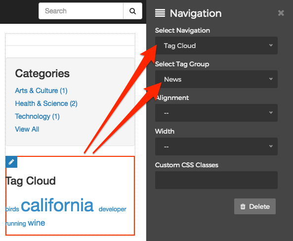
  5. Select "Tag Cloud" from the Select Navigation menu, and then select your desired tag group from the Select Tag Group menu. Once you do, the display object will dynamically update to reflect your configured options.
  6. When you're done making edits, select your desired publishing option to save your changes.

Summary

In this section, we covered how to manage navigation menus, layout templates, categories, and tags. We also reviewed some of the display objects that are available in Mura CMS and how to apply them to your various layouts.

In the next section, we'll dive deeper into content editing, and learn more about the various fields that are available to use.