Admin Tables
Table markup in the Mura 7 admin is fairly standard, with a few special conventions to manage the left hand "actions" menu and fluid-width or hidden responsive columns.
Basic Table Structure
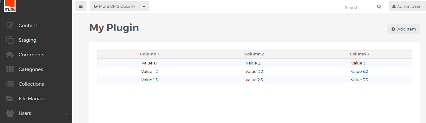
To create a table with the default admin styling, use the class "mura-table-grid" on the <table> element,
with a <thead> wrapper for the header row, and a <tbody> wrapper for the value rows.
<table class="mura-table-grid">
    <thead>
        <tr>
            <th>Column 1</th>
            <th>Column 2</th>
            <th>Column 3</th>
        </tr>
    </thead>
    <tbody>
        <tr>
            <td>Value 1.1</td>
            <td>Value 2.1</td>
            <td>Value 3.1</td>
        </tr>
        <tr> ... </tr>
        <tr> ... </tr>
    </tbody>
</table>
Actions Menu
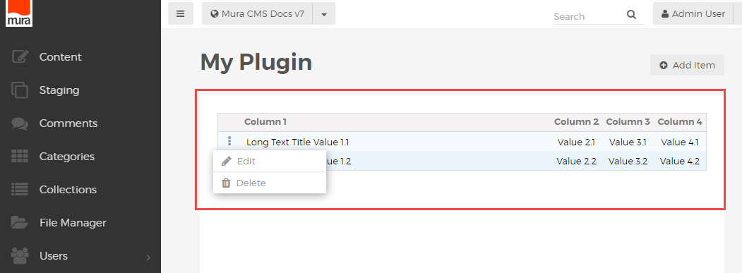
Mura 7.0 introduced the new actions menu component, which appears as a simple drop menu on the left side of many tables. This is simply an ordered list of links, within a cell using the "actions" class, with a special javascript-enabled link with class "show-actions" which shows the actions menu when clicked.
<td class="actions">
  <a class="show-actions" href="javascript:;" ontouchstart="this.onclick();" onclick="showTableControls(this);"><i class="mi-ellipsis-v"></i></a>
    <div class="actions-menu hide">
      <ul class="actions-list">
        <li class="edit"><a href="..."><i class="mi-pencil"></i>Edit</a></li>
        <li class="delete"><a href="##" onclick="..."><i class="mi-trash"></i>Delete</a></li>
      </ul>
    </div>
</td>
This can be used to list any number of additional options, available for each row of the table.
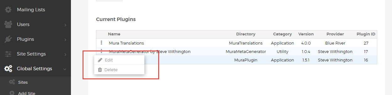
The corresponding header, also using class "actions", appears as extra spacing, matching the width of the actions column below.
Responsive Columns
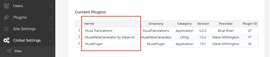
Keeping with the fluid concepts in the Mura 7 admin, columns can be made flexible by applying the class "var-width" to the <th> header and corresponding <td> cells in the rows of the table. This is most commonly used for the first column, containing the title or name of the item being listed.
Long text values will be automatically truncated, allowing for flexible-width tables without crowding.
To omit some columns altogether on smaller screen widths, use the standard Boostrap classes, e.g. "hidden-xs", to hide those headers and cells.
<thead>
  <tr>
    <th class="var-width">Column 1</th>
    <th class="hidden-xs">Column 2</th>
    <th>Column 3</th>
    <th>Column 4</th>
  </tr>
</thead>
<tbody>
  <tr>
    <td class="var-width"><a class="alt" title="Column 1" href="...">Value 1.1</a></td>
    <td class="hidden-xs">Value 2.1</td>
    <td>Value 3.1</td>
    <td>Value 4.1</td>
  </tr>
</tbody>
Table Markup Overview
When following the Mura 7 markup conventions for tables in the admin area, your complete table html will look something like this:
<table class="mura-table-grid">
  <thead>
    <tr>
      <th class="actions"></th>
      <th class="var-width">Column 1</th>
      <th class="hidden-xs">Column 2</th>
      <th>Column 3</th>
      <th>Column 4</th>
    </tr>
  </thead>
  <tbody>
    <tr>
      <td class="actions">
        <a class="show-actions" href="javascript:;" ontouchstart="this.onclick();" onclick="showTableControls(this);"><i class="mi-ellipsis-v"></i></a>
        <div class="actions-menu hide">
          <ul class="actions-list">
            <li class="edit"><a href="..."><i class="mi-pencil"></i>Edit</a></li>
            <li class="delete"><a href="##" onclick="..."><i class="mi-trash"></i>Delete</a></li>
          </ul>
        </div>
      </td>
      <td class="var-width"><a class="alt" title="Column 1" href="...">Value 1.1</a></td>
      <td class="hidden-xs">Value 2.1</td>
      <td>Value 3.1</td>
      <td>Value 4.1</td>
    </tr>
    <tr>
      <td class="actions">
        <a class="show-actions" href="javascript:;" ontouchstart="this.onclick();" onclick="showTableControls(this);"><i class="mi-ellipsis-v"></i></a>
        <div class="actions-menu hide">
          <ul class="actions-list">
            <li class="edit"><a href="..."><i class="mi-pencil"></i>Edit</a></li>
            <li class="delete"><a href="##" onclick="..."><i class="mi-trash"></i>Delete</a></li>
          </ul>
        </div>
      </td>
      <td class="var-width"><a class="alt" title="Column 1" href="...">Value 1.2</a></td>
      <td class="hidden-xs">Value 2.2</td>
      <td>Value 3.2</td>
      <td>Value 4.2</td>
    </tr>
  </tbody>
</table>
Rendering a table which looks something like this: