Extended Attribute Sets
Extended Attribute Sets are essentially <fieldset> elements. In other words, they're a set of form controls, grouped under a common name. To create an Extended Attribute Set, follow the steps outlined below.
- From the back-end administration area of Mura, select Site Settings, click Class Extensions, and select Class Extensions.
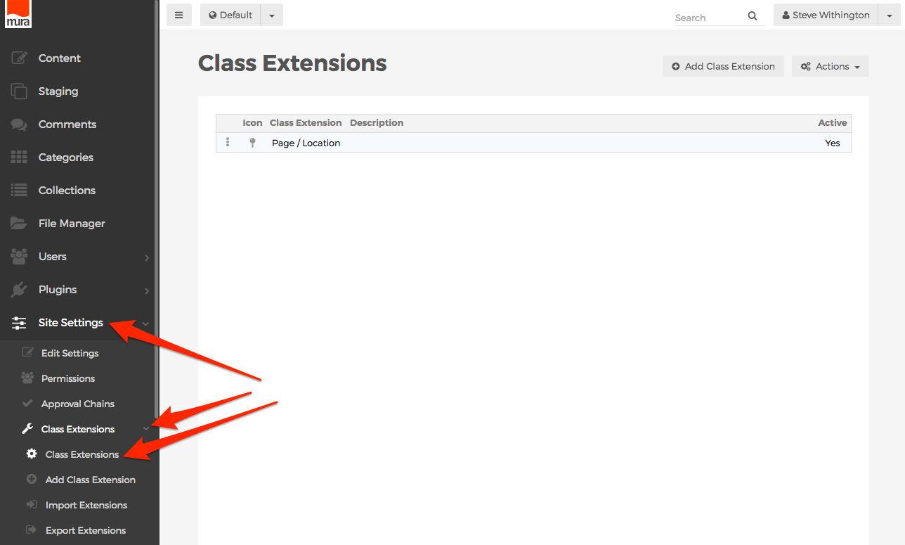
- You should be directed to the Class Extensions screen.
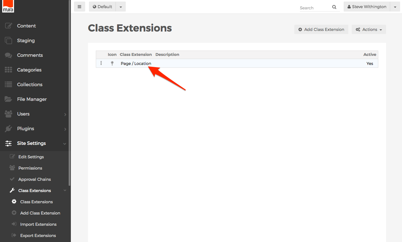
- Select the Class Extension you wish to add an Extended Attribute Set to, from the listing of available Class Extensions.
- You should be directed to the Class Extension screen. Here, you can view any available Extended Attribute Sets or Related Content Sets.

- To add an Extended Attribute Set, click the Add button, then select Add Attribute Set.
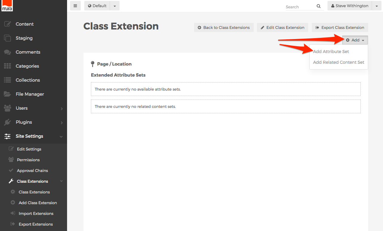
- You should now see the Add Attribute Set screen.

- Attribute Set Name
- The text entered here will be used as the
<legend>for the generated<fieldset>.
- The text entered here will be used as the
- Container (Tab)

- You may select the tab you wish to include your Extended Attribute Set on, from the listing of available tabs. The listing will differ, depending on the Base Type you selected when creating the Class Extension itself.
- If you select the Custom UI option, you're essentially telling Mura that you'll take care of collecting any attributes you're going to define. If you wish to add a new tab, and include a custom form for collecting the data, you may find this Gist useful: https://gist.github.com/stevewithington/f3dd405d5a188fb594a1
- Attribute Set Name
- Once you've entered an Attribute Set Name, and selected your desired Container (Tab), click the Add button to create your new attribute set.

- You should be directed to the Manage Extended Attribute Set screen. This is where you'll add, and manage your new attributes, or form fields.
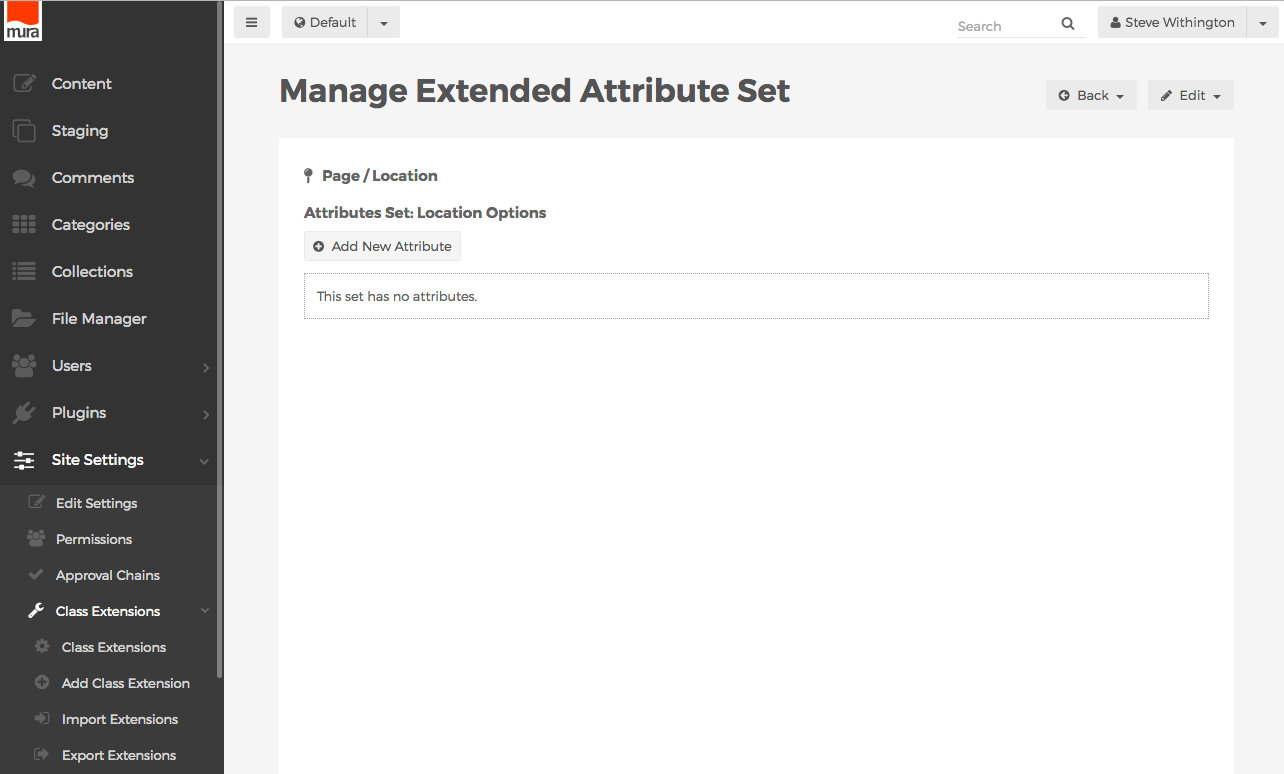
- To create a new attribute, click the Add New Attribute button.
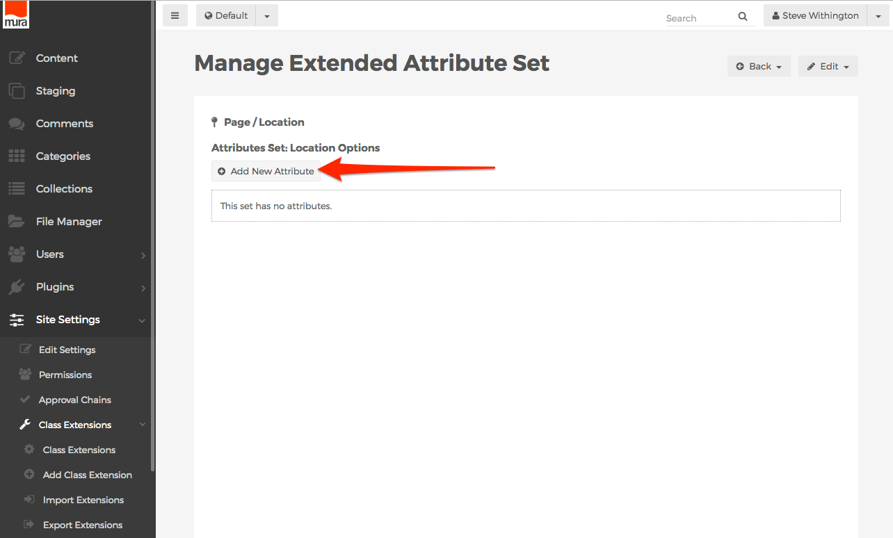
- The screen should now reveal a form to add a new attribute.

- Name (No spaces)
- Text entered here will be used as the
nameattribute of the form field. In addition, the text entered here is how you will reference any data entered for this attribute, as you'll see in the Displaying Extended Attributes section. It is important to use a proper naming convention, as if you were manually creating the input using HTML. Keep in mind that this form field will be included on a much larger form, and as such, you'll want to avoid using any of the bean object's attribute names so you don't run into any naming collisions. For example, you don't want to use the Name "title", since Content Beans already have an attribute labeled "title". - The recommended best practice is to prefix the
Namewith theSubtypeof your class extension. For example, if yourSubtypeequals "Location", instead of using "title" for the Name, you might use "locationtitle" for the Name.
- Text entered here will be used as the
- Label
- Text entered here will be used as the
<label>element.
- Text entered here will be used as the
- Input Type

- Select your desired input type from the option list.
- Default Value
- Optionally, enter a default value here. To include a dynamic value, you may use Mura [m] tags.
- Tooltip
- Optionally, enter text to be used as a tooltip.
- Required
- Whether the field is required. If True, Mura will use the option selected in the Validate field when the user submits the form.
- Validate

- If you desire the input to be validated before the form is submitted, select one of the following options.
- None
- Do not validate input.
- Date
- Validates data entered is a valid date. Mura will display a calendar UI widget for content managers to use when completing this form field.
- DateTime
- Validates data entered is a valid date and time. Mura will display a calendar and time UI widget for content managers to use when completing this form field.
- Numeric
- Validates data entered is an integer.
- Email
- Validates data entered matches standard email address formats.
- Regex
- Validates data entered against the JavaScript regular expression entered in the Regex field.
- Color
- If the Input Type is set to TextBox, and this option is selected, Mura will display a "color picker" UI widget for content managers to use when completing this form field.
- URL
- Validates data entered matches standard URL formats.
- None
- If you desire the input to be validated before the form is submitted, select one of the following options.
- Regex
- If Validate is set to Regex, Mura will use the JavaScript regular expression entered here to validate data entered in this form field.
- Validation Message
- If Required is set to True, text entered here will be displayed to content managers if the data entered in this form field does not pass validation rules.
- Option List ("^" Delimiter)
- This carat ("^") delimited list of "option values" will be used if Input Type is set to SelectBox, MultiSelectBox, or RadioGroup. For example, "option1^option2^option3". To include a dynamic value, you may use Mura [m] tags.
- Option Label List (Optional, "^" Delimiter)
- This carat ("^") delimited list of "option labels" will be used if Input Type is set to SelectBox, MultiSelectBox, or RadioGroup. For example, "Option 1^Option 2^Option 3". To include a dynamic value, you may use Mura [m] tags.
- For Administrative Use Only?
- If Yes, the field will not display for content editing purposes, and will be a hidden form field.
- Name (No spaces)
- After you've completed the form, click the Add button to create your new attribute.

- Repeat these steps to create additional attributes for the Extended Attribute Set.
- The attributes sort order is the order in which they will be displayed to content managers. If you wish to reorder any of them, click the Reorder button.
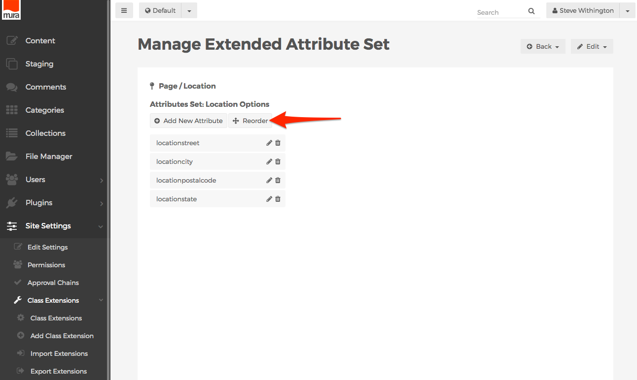
- Then, hover over the attribute you wish to move, and then click, drag, and drop to your desired location.
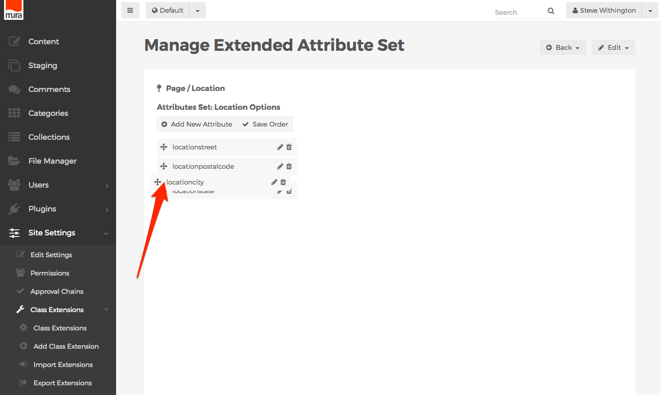
- When finished reordering, click the Save Order button.
 ???????